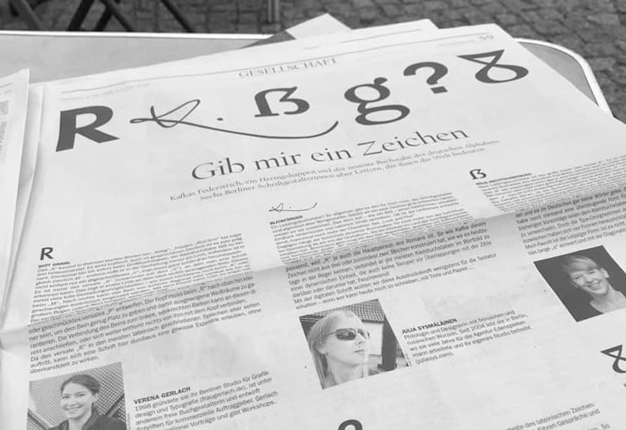
“Which one is your favourite letter?”
Berlin daily “Der Tagesspiegel” asked, I answered:
“In such a general way, there is no such letter for me. Not only in the Bible but also for us type designers, the first thing is the Word. We are actually more word designers than letter designers, and as soon as we have roughly drawn a few characters, we build words out of them. The word-picture should make a certain impression visually and, of course, convey content. Readability is often crucial, but sometimes even more so is the look and feel.
Beautiful or less beautiful words exist visually as well as acoustically, but this is naturally very subjective and depends on linguistic surroundings. For example, many Germans find the sound of ‘rakastan’ inappropriate for ‘I love’. Finns do not think so.
On the other hand, in an exercise both my Finnish and German students found the word-picture of ‘Baltique’ particularly aesthetic, which I would attribute to the rhythmic interplay and richness of the forms it contains.
But on the subject of beautiful letters: For me, it depends more on the individual design than on the basic form that a character has received in the course of the history of writing und type. An example: I am really fond of the attention-grabbing capital K of a connected script shown here. It comes from Franz Kafka's manuscript for his famous novel ‘Der Process’, and was incorporated by me and FontShop colleagues into the digital script font ‘FF Mister K’. The K is written with an energetic continuous swing, as is usually only found in signatures. It juts out far beyond the letters it is surrounded by in the texture of the text. A real eye-catcher on Kafka's handwritten pages – very fitting, because ‘K.’ is also the main character of the novel. Just as Kafka did not construct this K from 3 or at least 2 strokes – as we tend to do it today – he connects most of the letters in the words to dynamic units that also have no scruples about overlapping with the line above or below. Fascinating!
With the typeface ‘FF Mister K’ we tried to preserve this expressive power – at least for the keyboard. After all, who can still write like that today, using only ink and paper …