FinlandiaScript is a typeface in reminiscence of composer Jean Sibelius.
Some 40 km north of Helsinki, surrounded by meadows and a serene Finnish lake, lies Ainola, the former home and now museum of composer Jean Sibelius (1865–1957). It’s a wonderful place for small excursions from the capital city, especially in spring, when the days are getting longer, with the snow melting in the sun and the ice cracking on the lake.
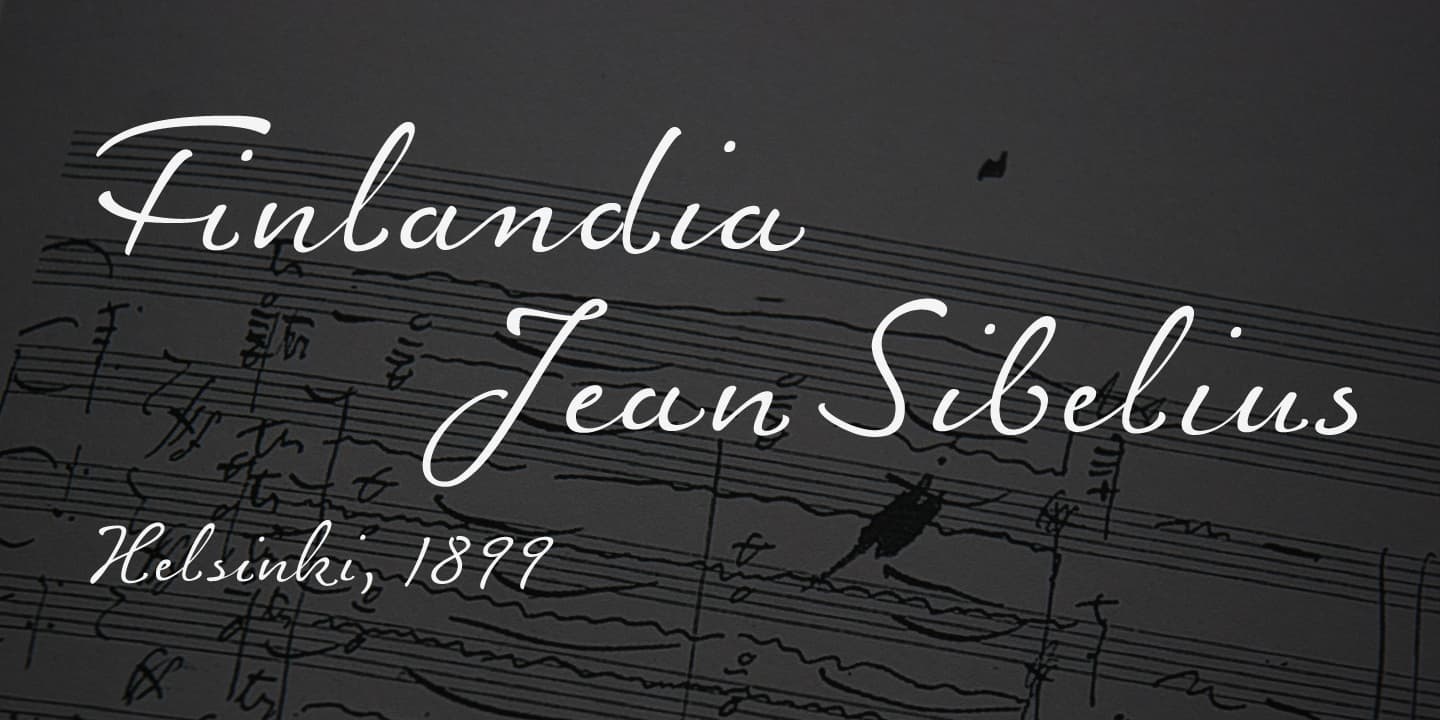
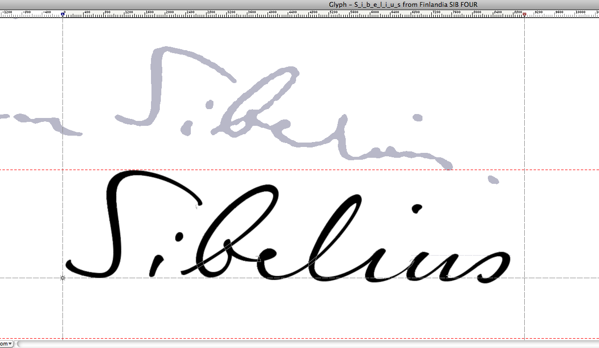
Sibelius often professed his love for the landscape around Ainola and found constant inspiration in its moods, sounds and scents. For many of us, Sibelius and his music, most notably his famous symphonic poem Finlandia, are a symbol of Finland. The typeface FinlandiaScript owes its influence to both Sibelius’ manuscripts and the meadows, forests and lakes around Ainola. The shape of letters, their poise and the rhythm they create resemble Sibelius’ handwriting without copying it. Gently flowing FinlandiaScript lines of text are very legible and have strong individuality.

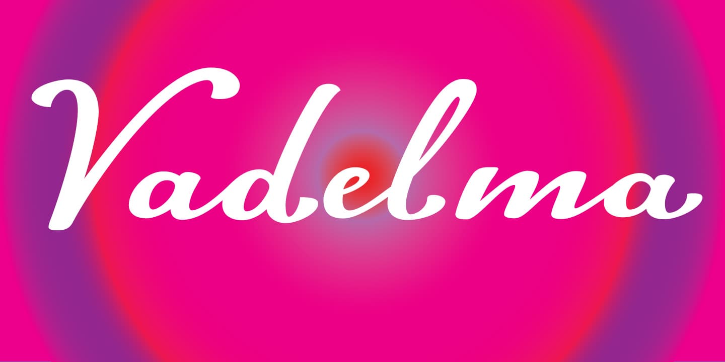
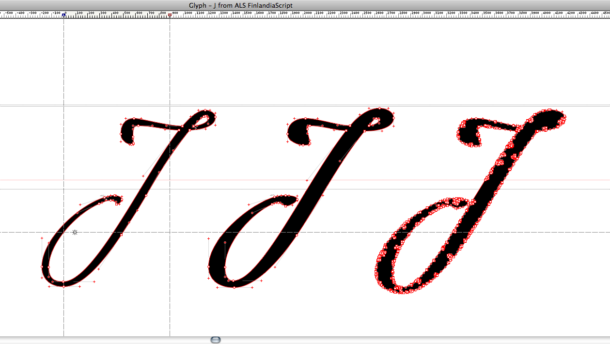
The font family comes in three styles: FinlandiaScript, FinlandiaScript Bold and FinlandiaScript Frost. Together they are perfect for magazines, websites and brands aiming to create a personal and sincere image. While the fine details of FinlandiaScript Frost are best suited for display sizes, FinlandiaScript and FinlandiaScript Bold work well in both headlines and running text sizes with hundreds of ligatures giving them a rhythmically balanced appearance.
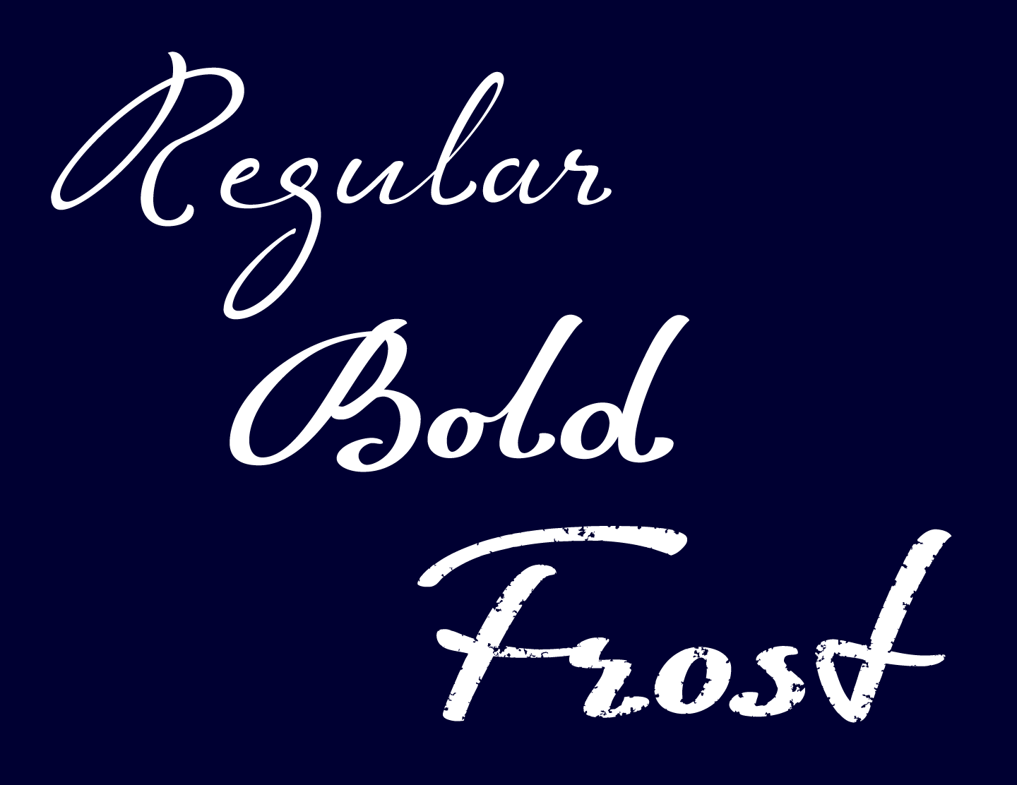
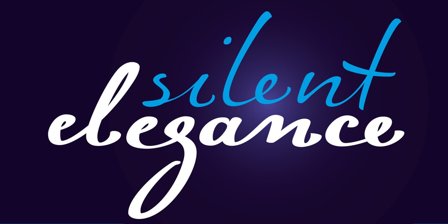
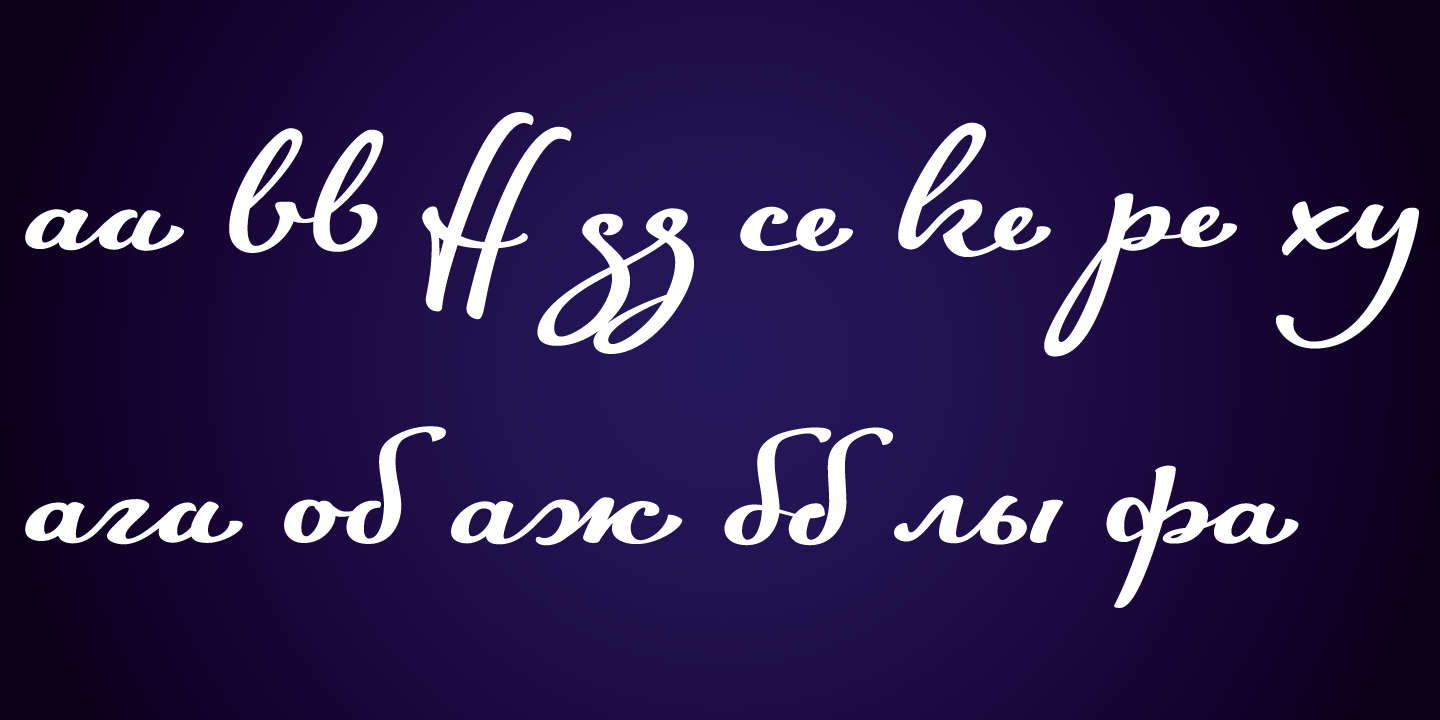
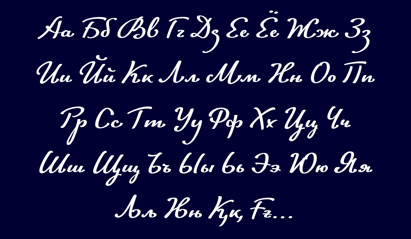
The FinlandiaScript family contains Western, Central European and Extended Cyrillic character sets and supports almost 100 languages. It is best suited for OpenType savvy programs with the “standard ligatures” and “contextual alternates” features turned on.
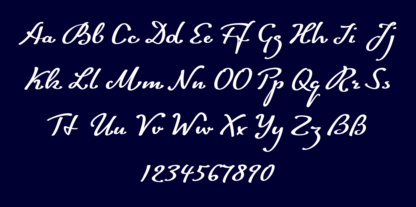

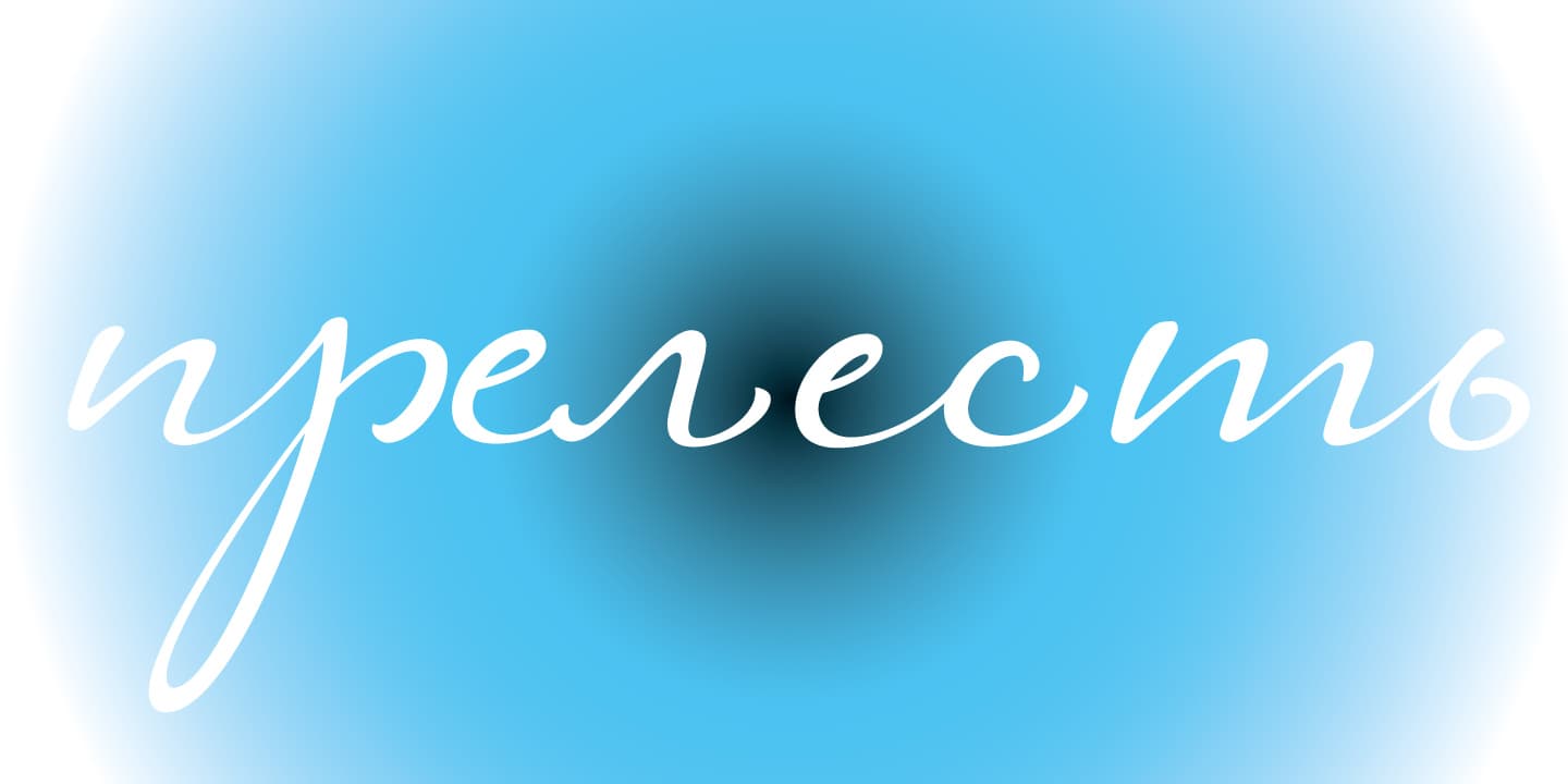
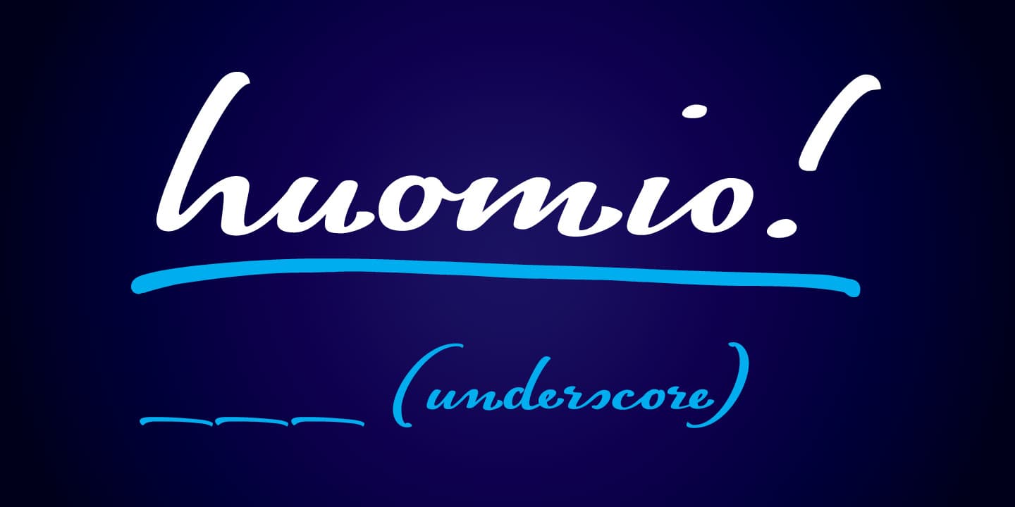
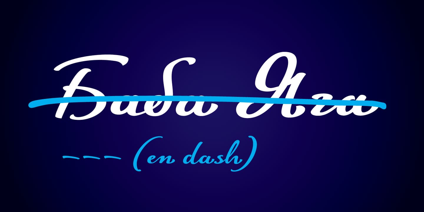
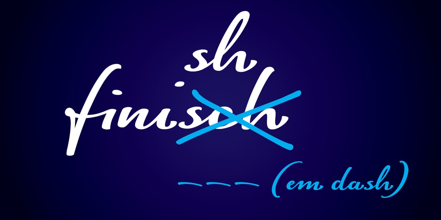
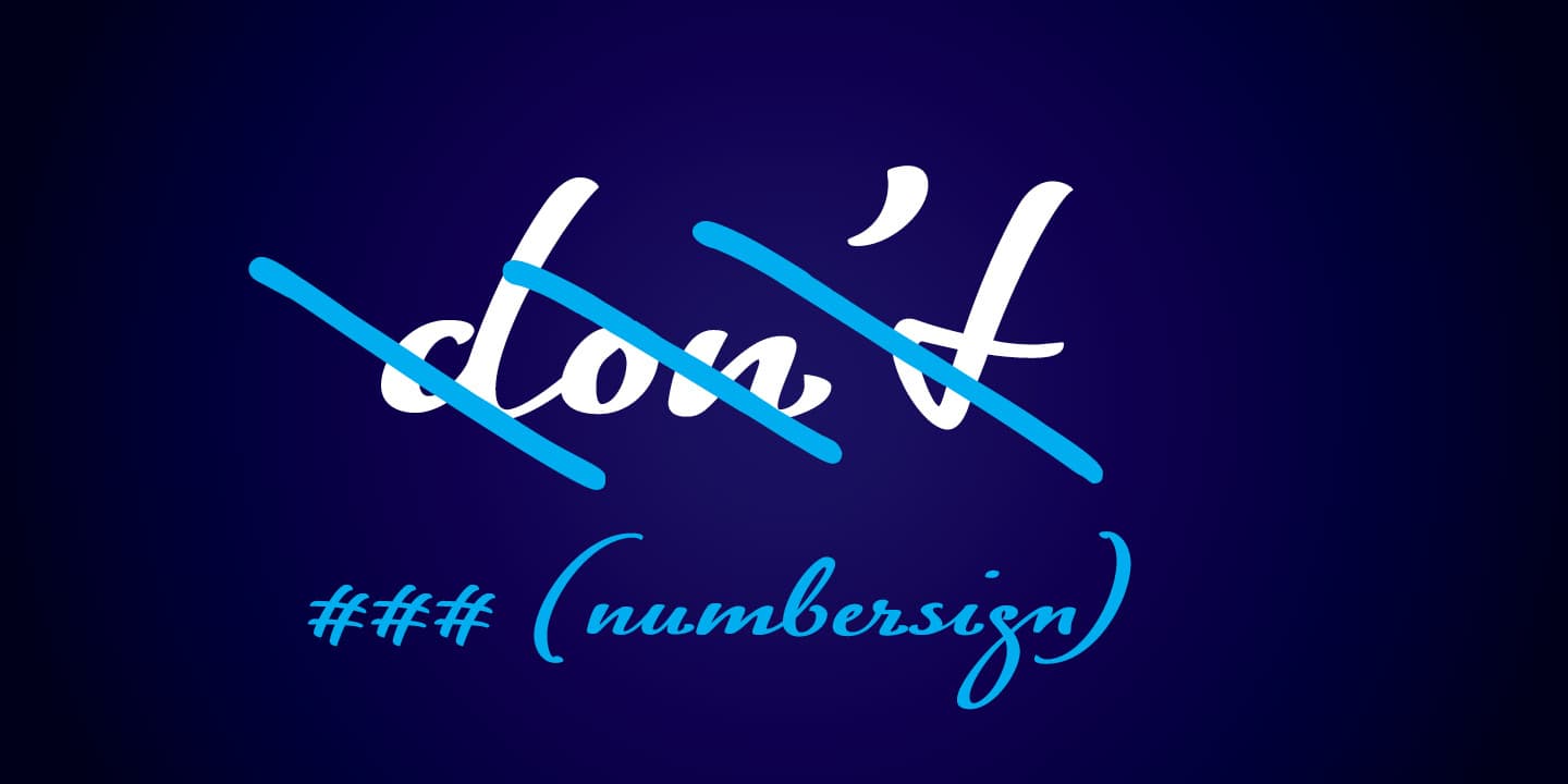
It’s the OpenType features that breathe life into FinlandiaScript. Below are some examples of how you can make use of them.
