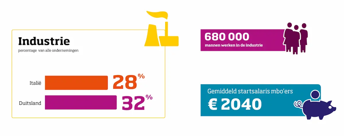
Numbers, numbers, numbers … are the essence of statistics. In our times of quick-reading numbers need visual assistants to help them enter – and stay – in our information flooded brains. Pictogram-style images can do exactly that. They put numbers in context, immerse them with meaning and give them heart and soul.
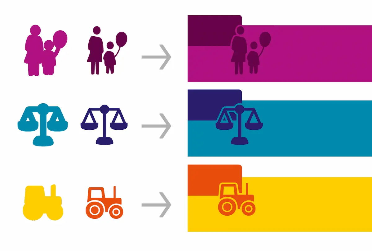
When redesigning the corporate image of “CBS” (Dutch Central Office for Statistics) it was quite logical for Edenspiekermann_ Amsterdam to let numbers in conjunction with pictograms become the key visual elements. Julia Sysmäläinen did the design of the CBS pictogram family and gave it a very distinct style.

The pictograms are related to the headline typeface Soho, a sturdy rectangular and at the same time slightly softened slab serif. Formal elements like the softened rectangularity and weightiness find their equivalent in the pictogram style. The little images transmit an attitude of relaxation, sympathy and humor amid the serious world of statistics. Small details stress the commitment to correctness of facts. More about the More about the CBS Identity.
