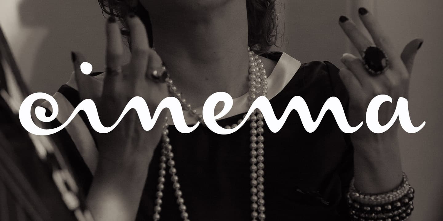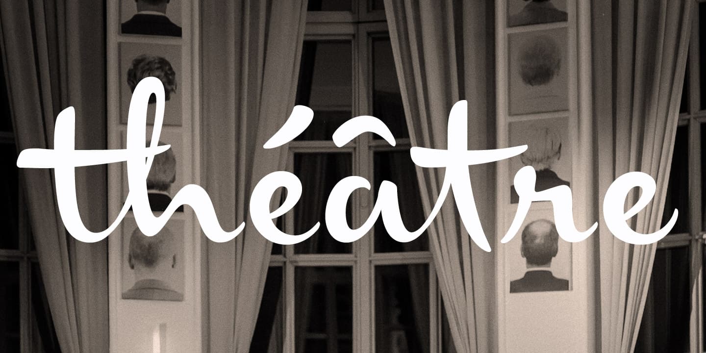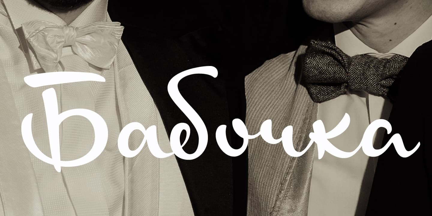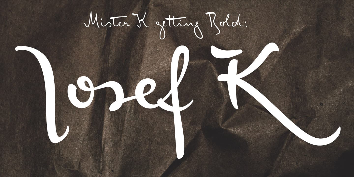
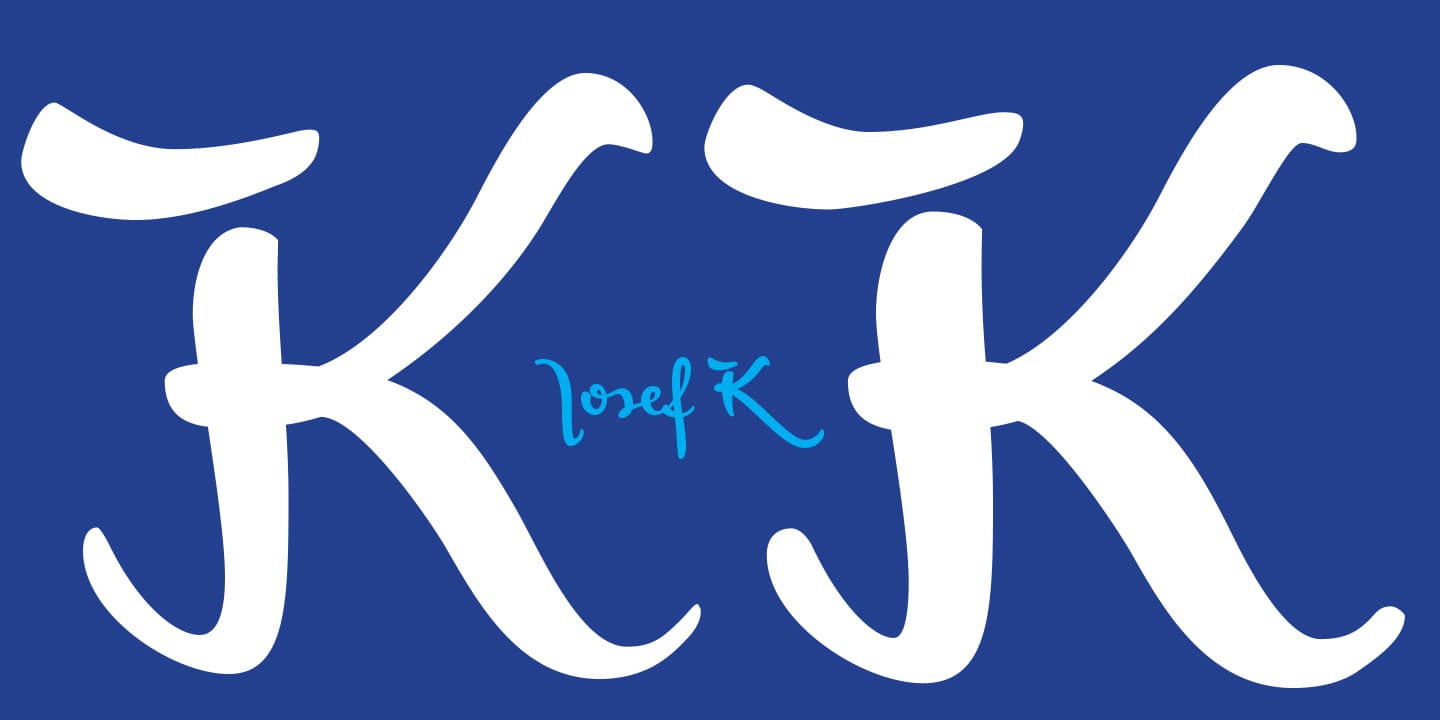
Like the FF Mister K type family “Josef K Paneuropean” and “Josef K Strong European” are derived from Franz Kafka’s writing style. This time the source of inspiration was not the literary work Kafka created at night as an author, but the texts he produced during daytime in his professional life as a high-ranking bureaucrat – Dr. Franz Kafka.
The Josef K fonts echoe Kafka’s prestigious status at the Workmen’s Accident Insurance Institute of the Austro-Hungarian Empire. Their ductus, originating from a broad-nibbed ink pen combines a clear, self-confident stroke with the calligraphic features so typical for Franz Kafka’s handwriting.

While both typefaces are more straightforward and bolder than the wonderfully erratic fonts of the FF Mister K type family. Josef K Paneuropean font is best characterized as a semibold handwriting textface. Josef K Strong European, the latest “K”-accomplishment, is a distinctly bold display typeface and provides an ideal complement to the former. It is great for headlines, product names and branding and combines perfectly also with all the FF Mister K fonts.

Josef K is a largely connected script and contains a complex OpenType feature code that determines the positioning of its glyphs. Texts set in the font get their most lively appearance when OpenType savvy programs are used and “standard ligatures” and “contextual / stylistic alternates” are turned on.
