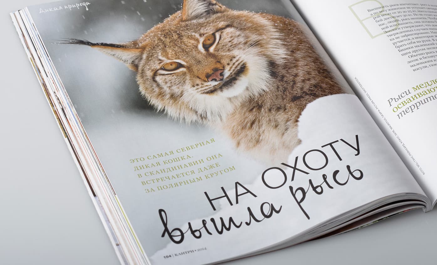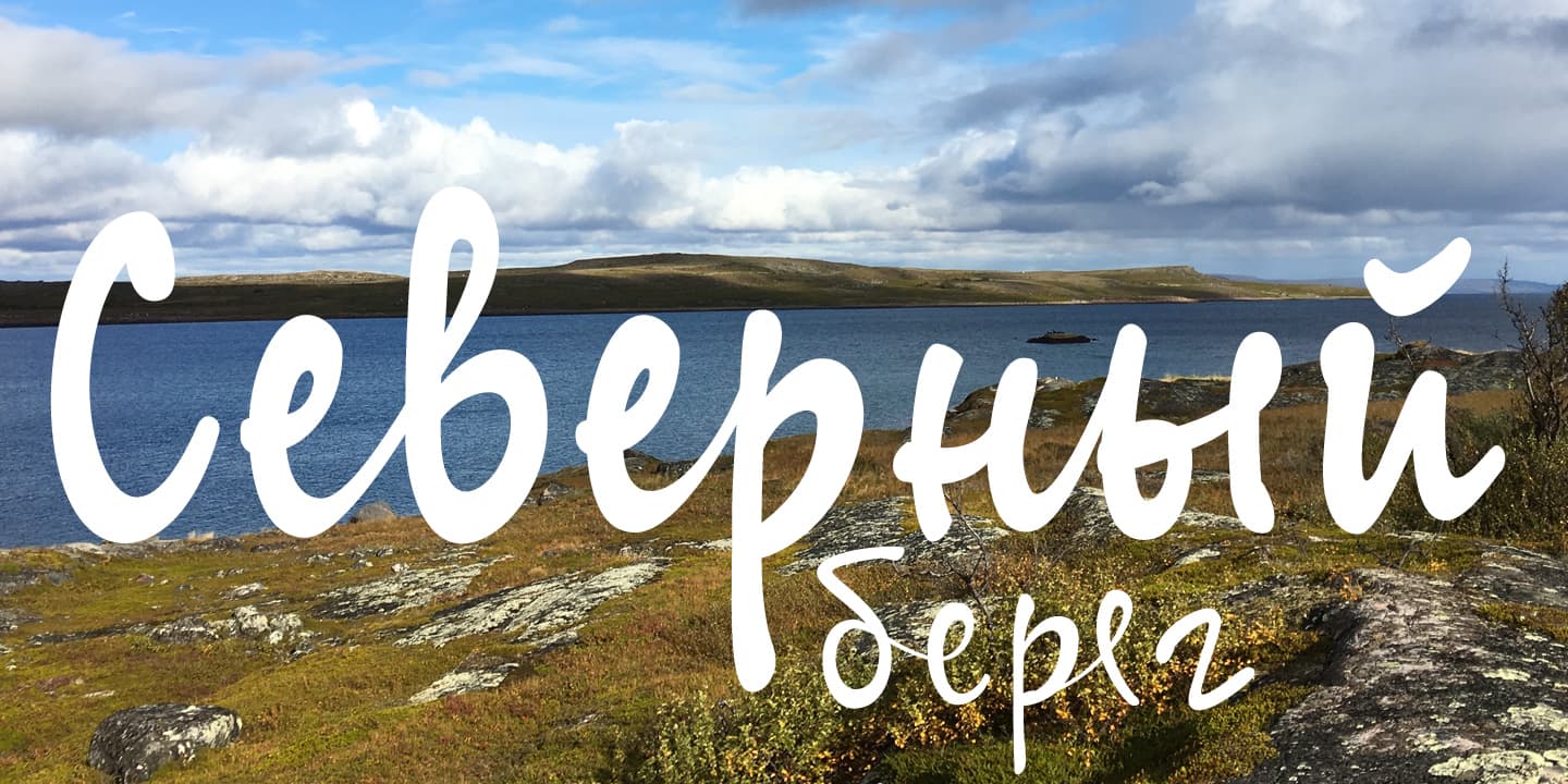
My aunt Katri from Kontupohja had a very kind but also energetic character, and her handwriting is a mirror of it. I was fascinated by a few sentences she had written on a postcard inviting me to go mushrooming, and I decided to make them the starting point for a typeface dedicated to her. The name “SyysScript” is Finnish and translates as “Script of Autumn”, Katri’s favorite season – harvesting time, time for collecting the fruits of nature in the forest and the garden.
SyysScript has strong visual attributes but is easily readable. The font’s many OpenType features and a bundle of alternates for each character give texts written in SyysScript a very natural look.
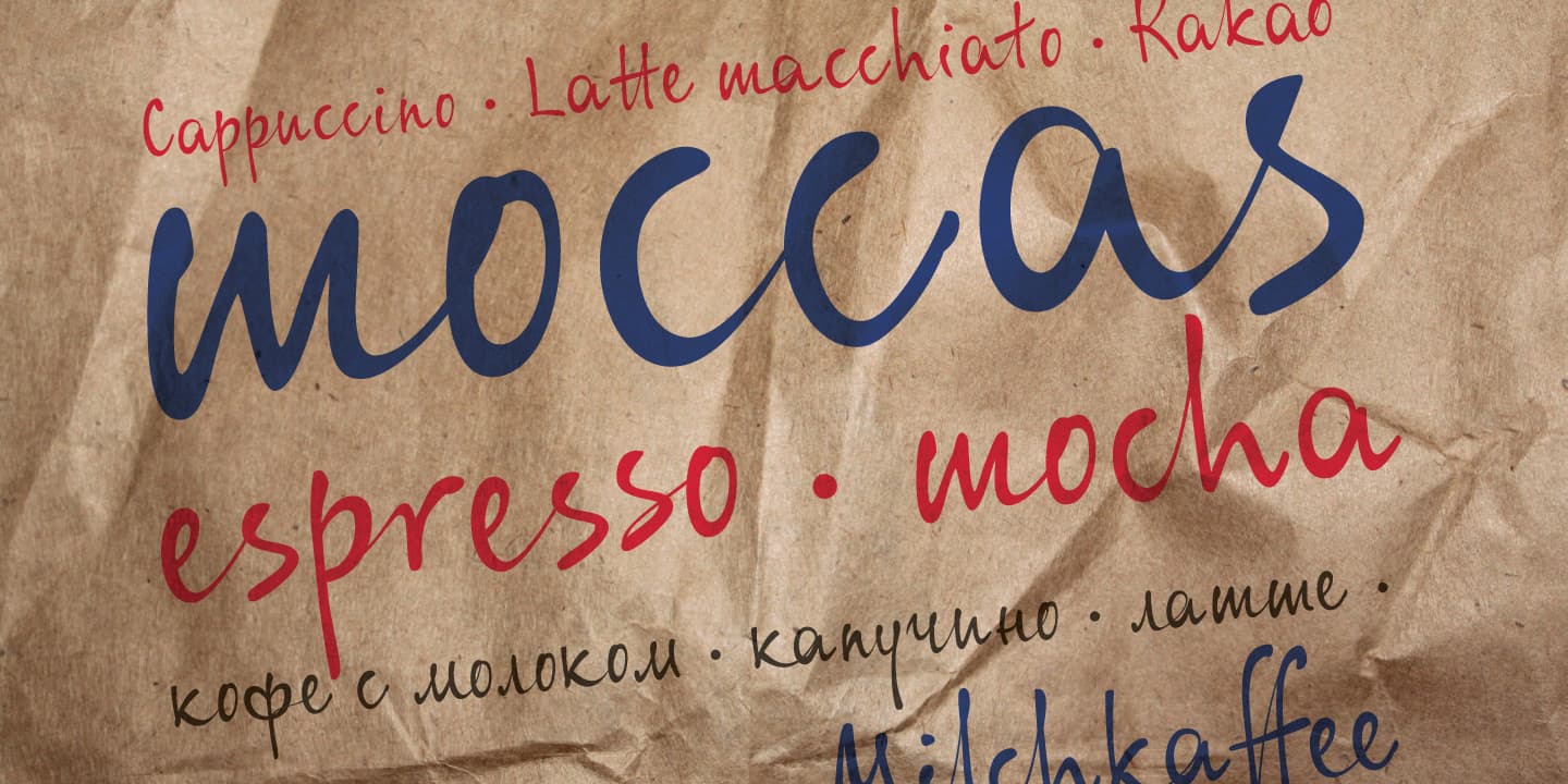
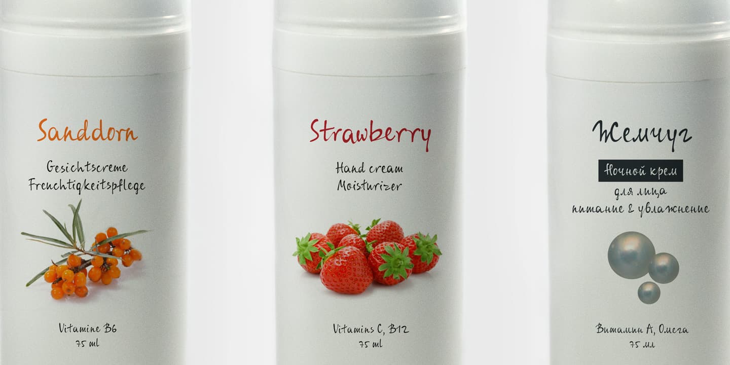
Syysscript Regular with long ascenders and descenders is very expressive and is perfect to use as a display font. Syysscript Eco keeps the personal charm of the original but has more compact proportions and simplified outlines. It is space-economical and legible in dense surroundings, such as packaging.
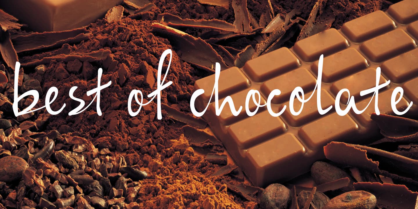
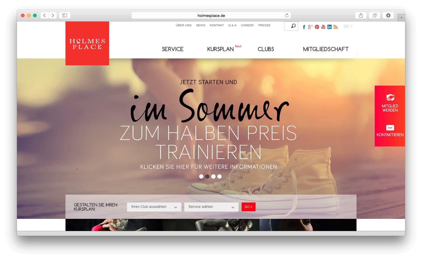
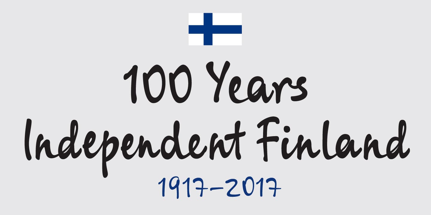
Two long awaited newcomers, Syysscript FeltTip and Syysscript FeltTip Eco recently joined the family. They are bolder and softer than the previous styles but have the same positive, lighthearted feel. The “felt tip styles” are equally well suited for paper, packaging, a screen or even a concrete wall …

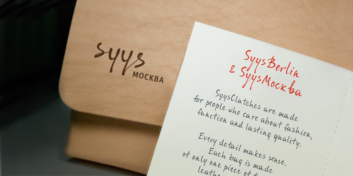
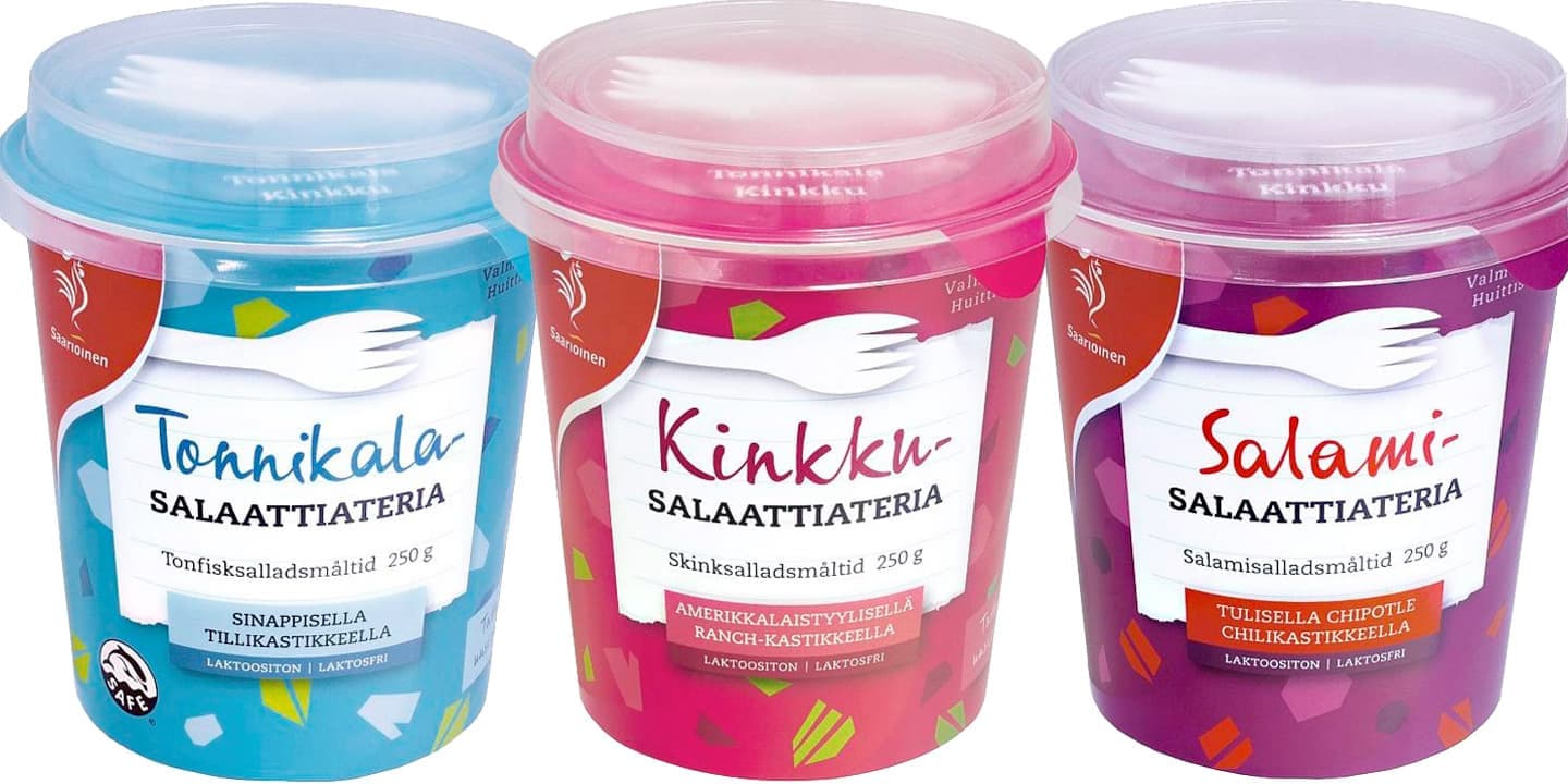
SyysScript fonts support Latin and Cyrillic Extended. Today they can be found for example on packaging in all parts of the Europe.
