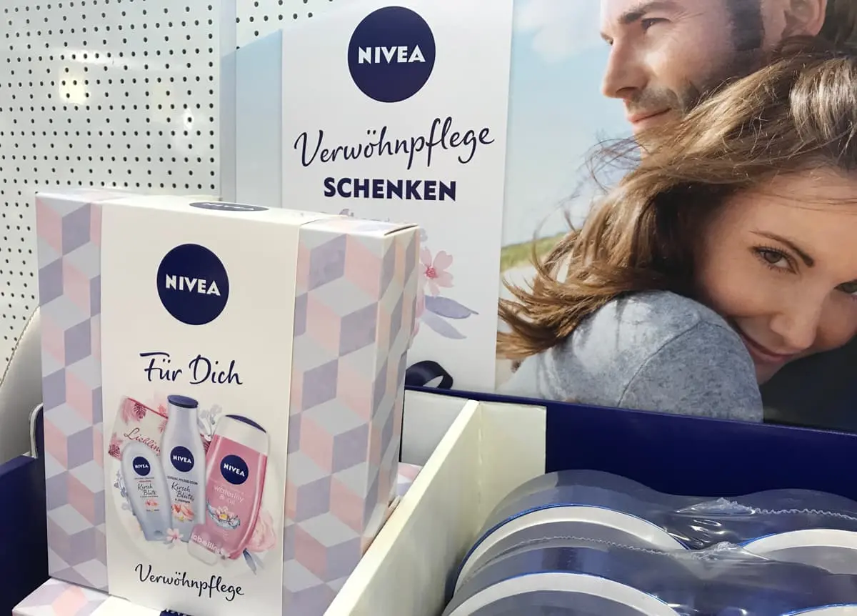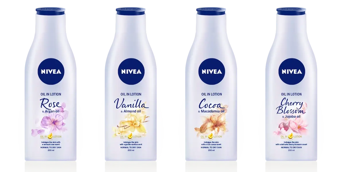
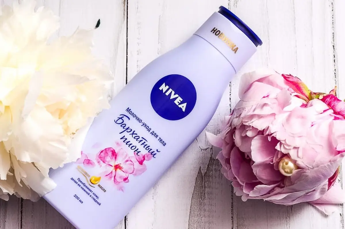
Juliasys Type Studio was commissioned by Beiersdorf AG to develop a digital handwriting style for their NIVEA brand. The “NIVEA Care Type” is seen as the imaginary handwriting of the NIVEA persona, the “NIVEA Woman”. The typeface has the function to subtly integrate the NIVEA Woman personality in the look and feel of the brand. The two fonts NIVEA Care Type Latin and NIVEA Care Type Cyrillic are continuously implemented internationally on product packaging, especially for new product lines.
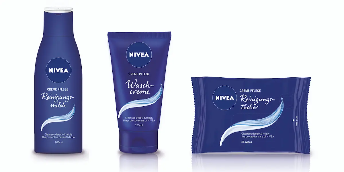
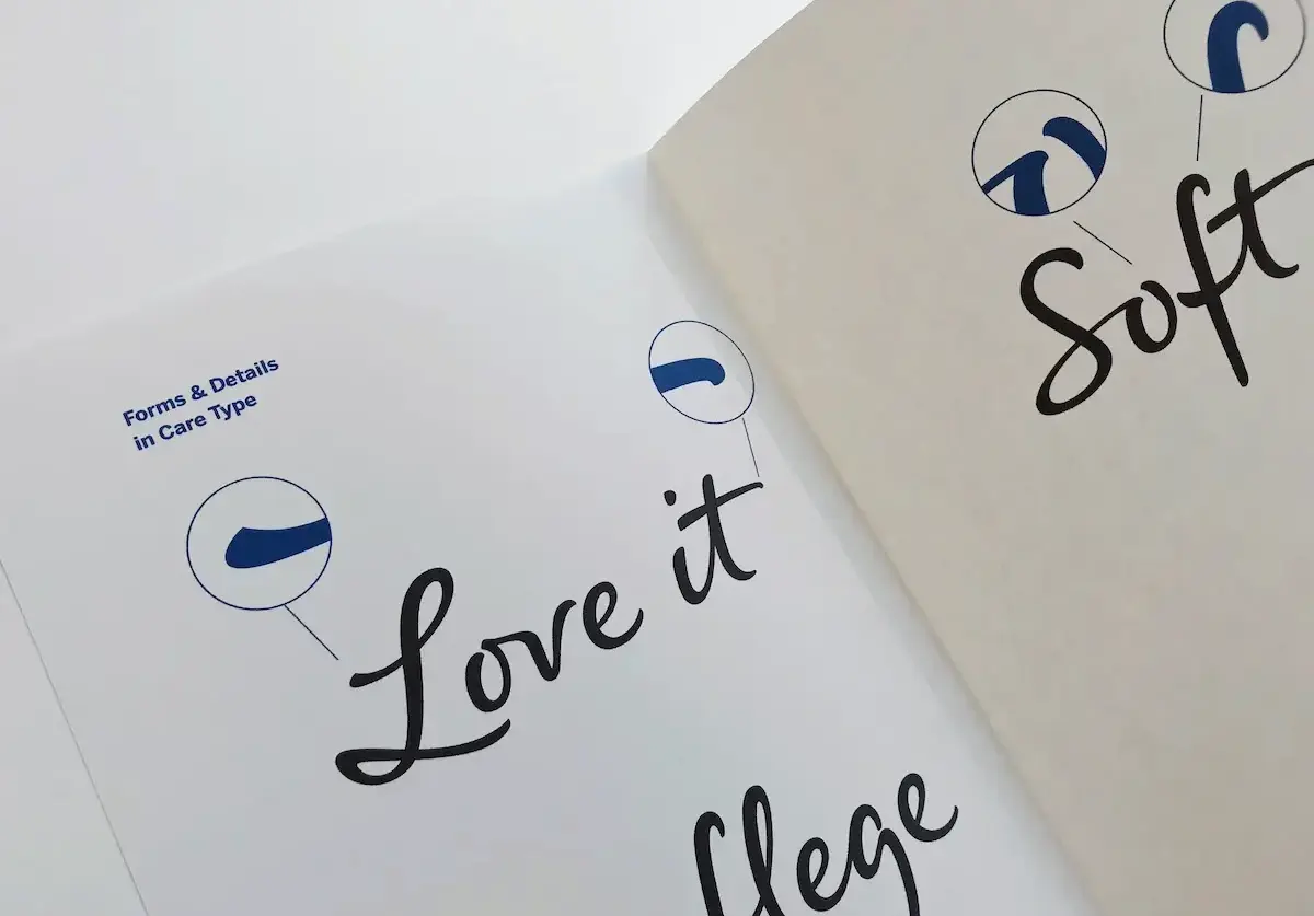
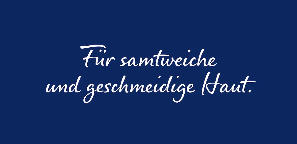
The font has been developed with great attention to detail. Sweeping shapes lend dynamism. Long horizontal strokes emphasize the energetic impression and little details, especially at the stroke endings, give NIVEA Care Type its distinct appeal.
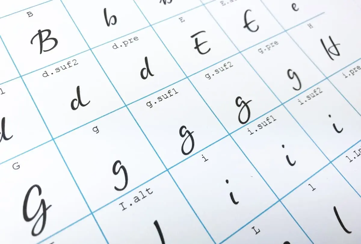
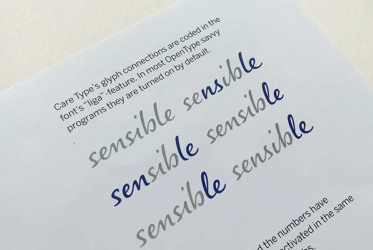
When we write by hand, every character is a little different. But how do you get that into a digital font? Without OpenType feature coding and many alternative characters it wouldn't work. Together, the Latin and the Cyrillic NIVEA Care Type fonts contain over 4000 glyphs, among them about 2500 ligatures, with coding for automatic contextual substitution. Amounts like these are a necessity to convincingly simulate a natural handwriting style in all its variations as a digital font.
Besides ligatures that are automatically inserted there are optional alternate glyphs for the word beginnings and endings (top).
For most characters there are at least four variants depending on their position in a word and in a line of text (below).
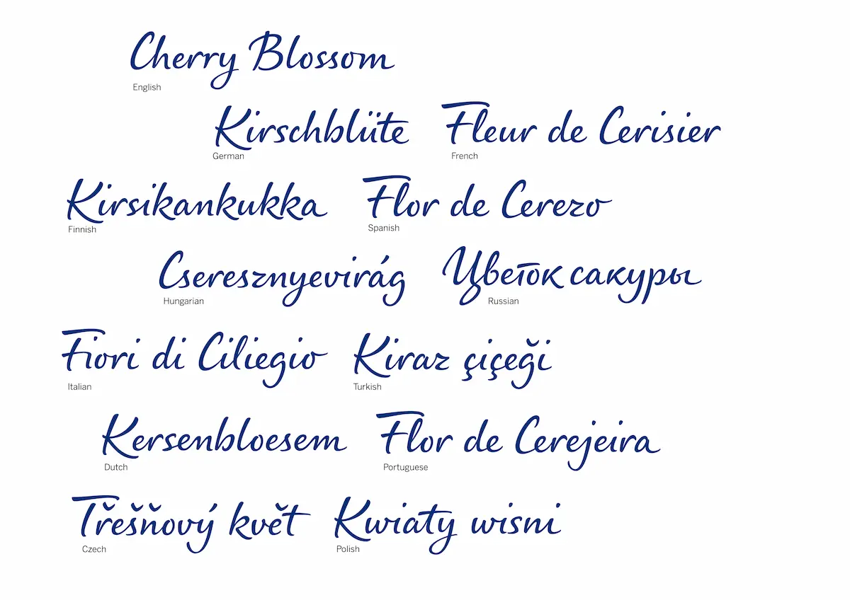
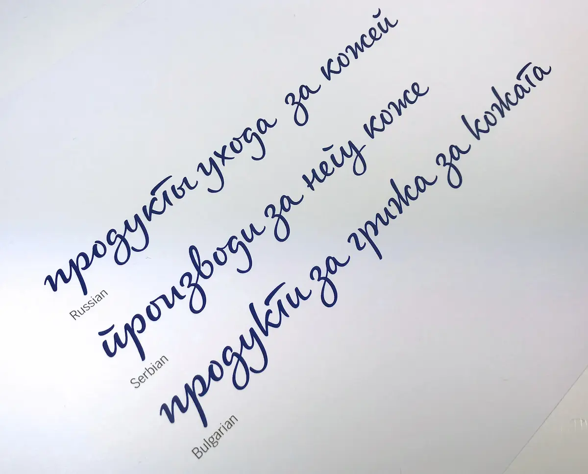
NIVEA Care Type font supports most European languages. The font is also actively used in languages with Cyrillic alphabets. Localised forms support regionally differing Cyrillic writing traditions.
Read the fascinating background story about NIVEA Care Type at alphabettes.org.
