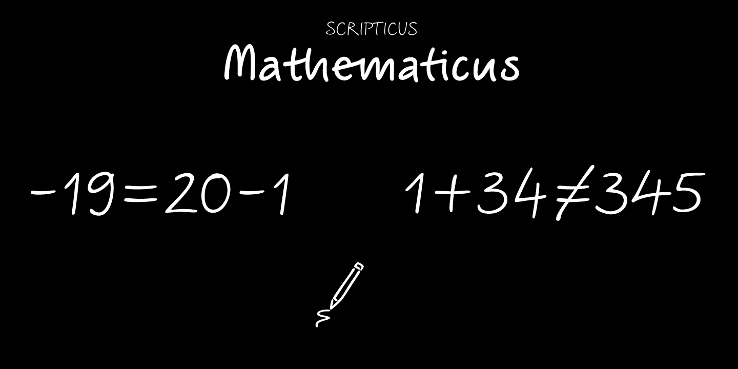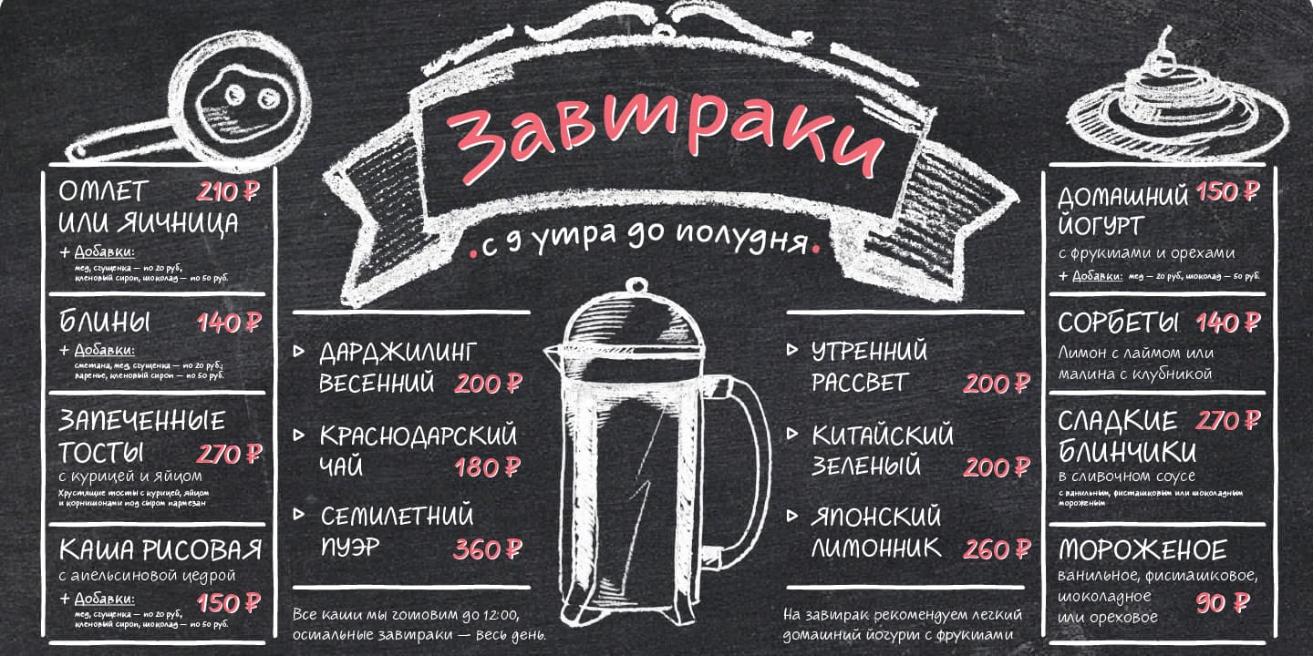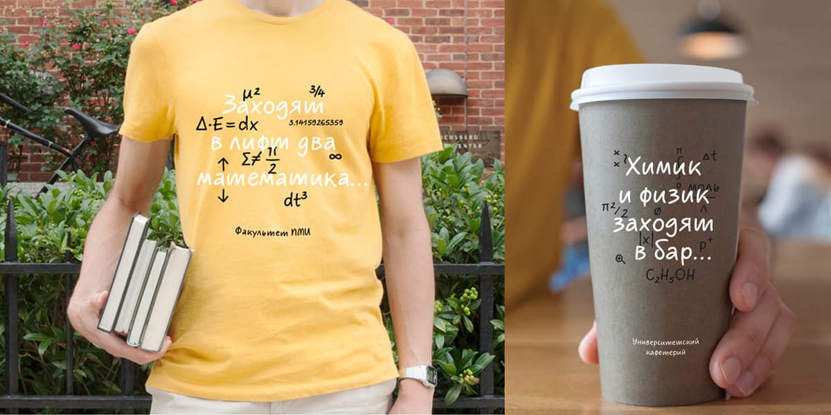
Scripticus is like a chameleon: In whatever surroundings you put it – it looks like it couldn’t be anywhere else. Is it an advertisement, a music website, a comic strip or a science journal with complicated equations – Scripticus always solves the problem in a natural and leisurely way. Without making compromises in regard to clarity. But where does Scripticus come from? From the good old high school blackboard! Still today, clear handwritten notes which appear on the board – be it a black or white one – while the facts are explained can really make things understandable. My high school chemistry teacher was an expert in doing this. Scripticus is dedicated to him.


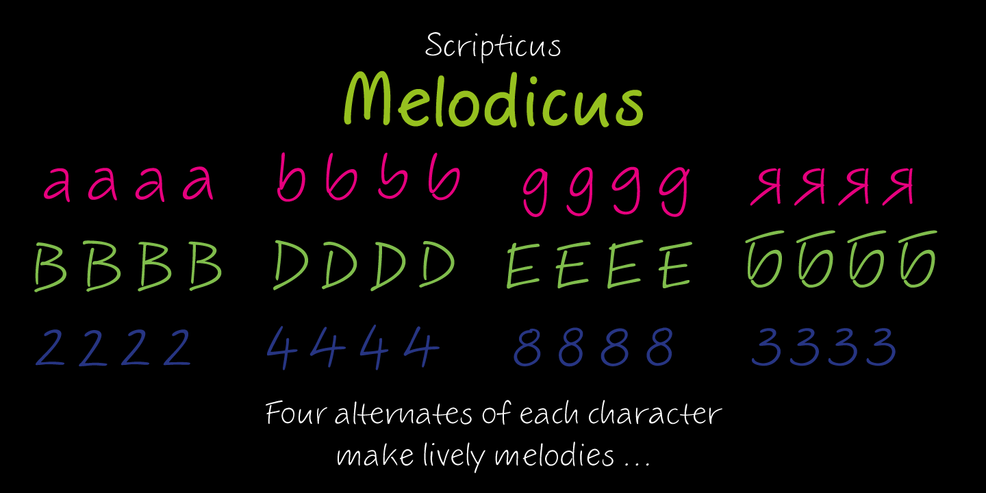
Scripticus uses a special trick to create a natural feel: Rotation coding for four alternates of each letter and each number lets glyphs appear in a lively sequence and reduces repetitions to a minimum. Some other Scripticus OpenType features are: tabular figures, contextual alternates, stylistic alternates / stylistic set, capital spacing, case sensitive forms, superscript, scientific inferiors, numerators, denominators, fractions, ordinals, historical forms, localized forms and ornaments. Below some examples of how they can be applied:


