“Typographica”, in the mid 20th century a renowned journal of visual design founded and edited by Herbert Spencer is today a digital platform for the review of typefaces and type related books.
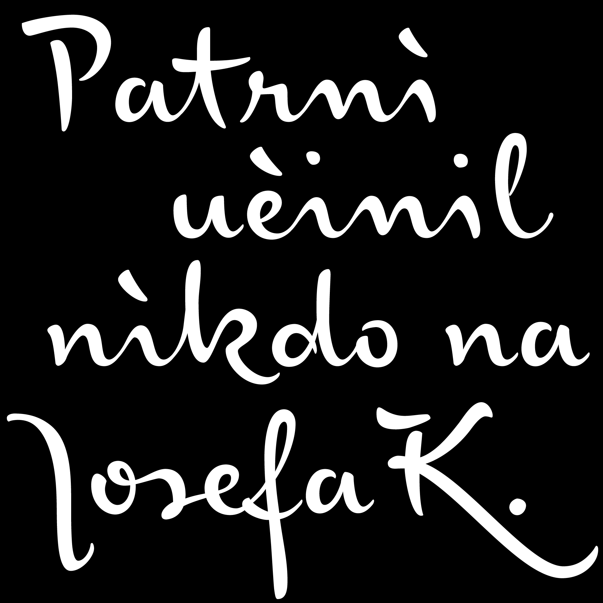
Each year, editors Stephen Coles and Caren Litherland ask connoisseurs of the type and lettering business to select and review their favourite typeface of the previous 12 months. Dutch writer and typography consultant Jan Middendorp selected our “Josef K Paneuropean” as his favorite typeface of 2015. This script font is the latest member of our Franz Kafka series which started off with “FF Mister K” and has received numerous awards. “Josef K”, in contrast to the previous “K-fonts”, is not inspired by the diary and manuscript texts Kafka usually scribbled down during night time but by his more orderly and authoritative office writing – as a high-ranking lawyer at the largest Accident Insurance Institute of Prague.
Middendorp’s review is a fun read not only for type-nerds. He takes a close look at the activities of today’s Berlin letter-maker scene focussing especially on its female half and on “feminine” type design products. Finally, he explains what it is that makes “Josef K” such a pleasure for him to use in his own work. Read the article at typographica.org.
