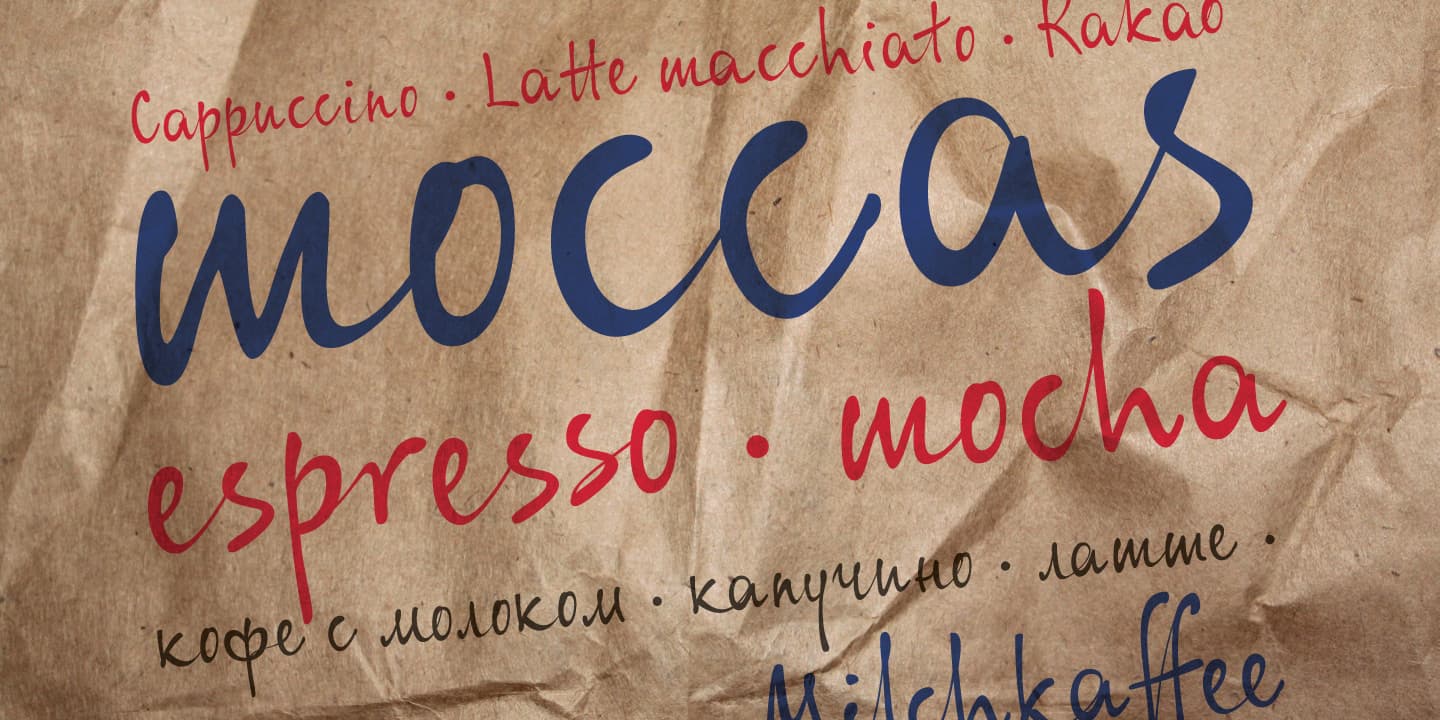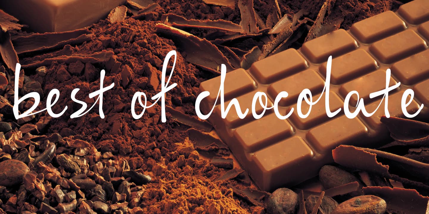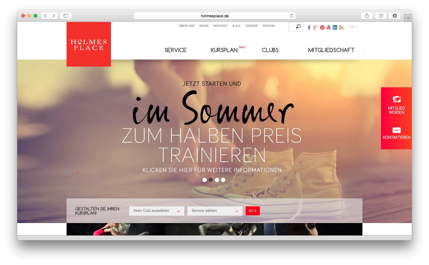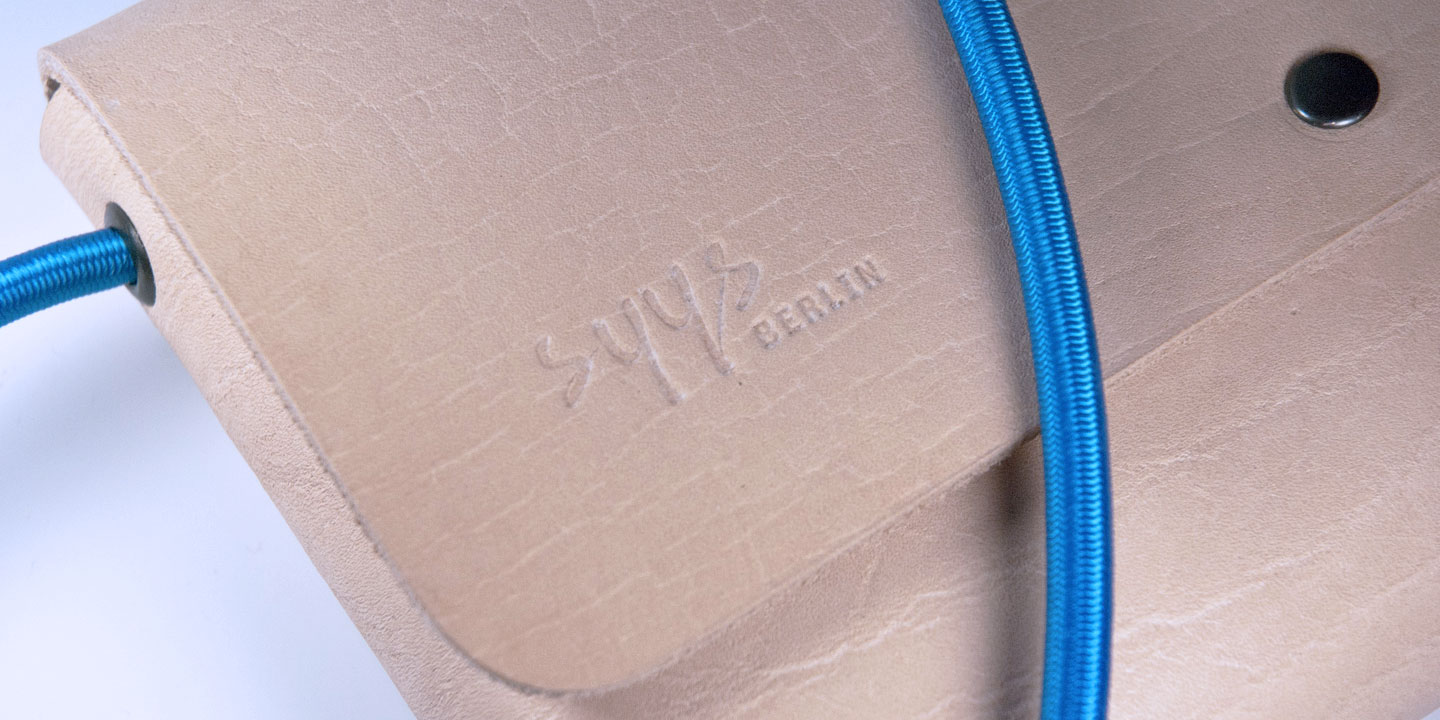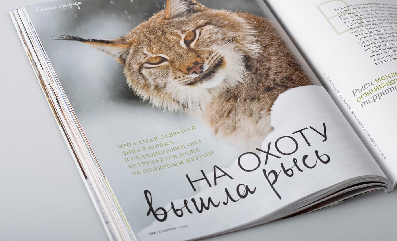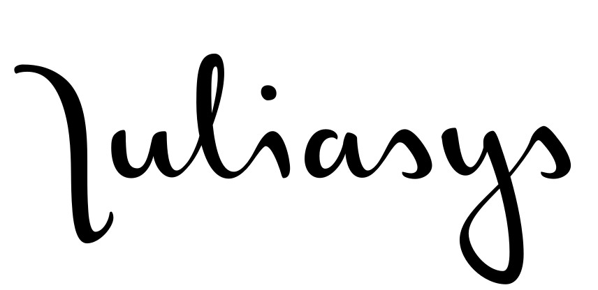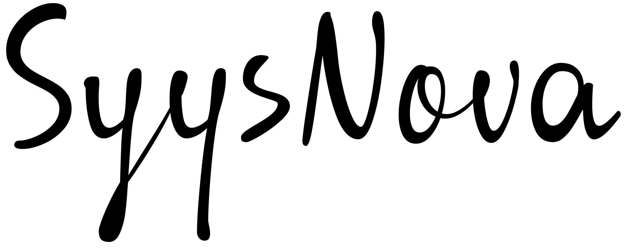
One handwriting, nine styles. Three weights. Three lengths. A variable axis between them. SyysNova turns a single script into a precise, controllable type system.
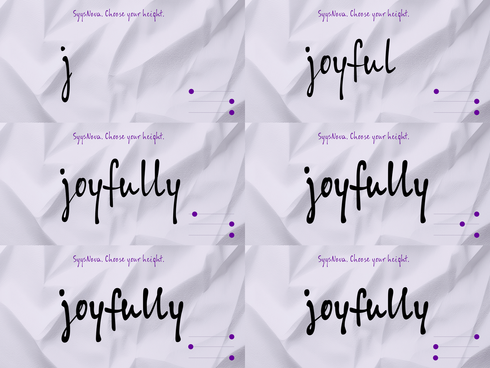
A handwriting is not naturally a system. SyysNova makes it one — three controlled ascender/descender lengths, named plainly, applied consistently across every weight.
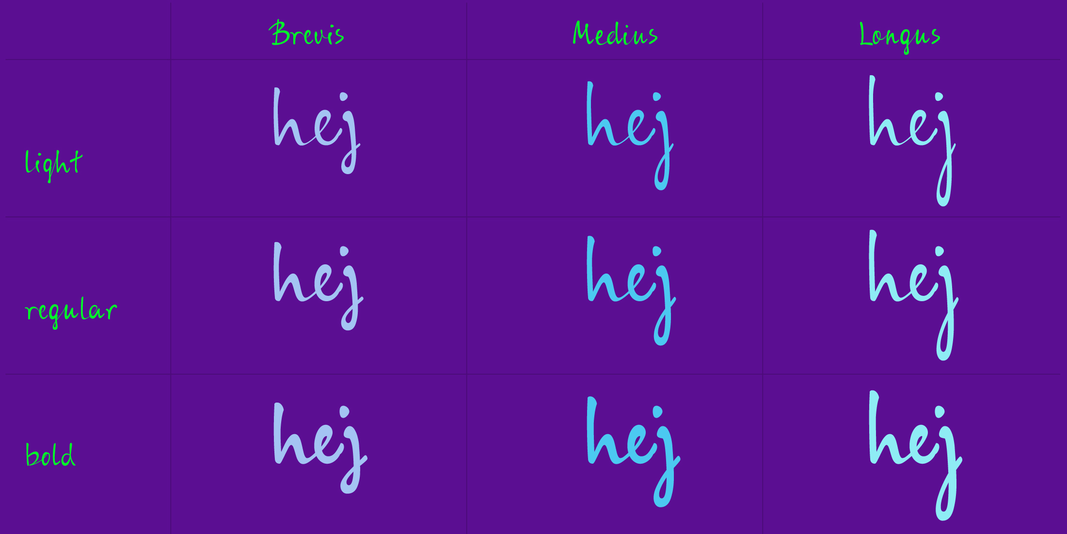
Light carries the lightest contrast, closest to the original pen stroke. Regular adds presence without losing the handwriting's speed. Bold holds its energy even at small sizes or on busy packaging.
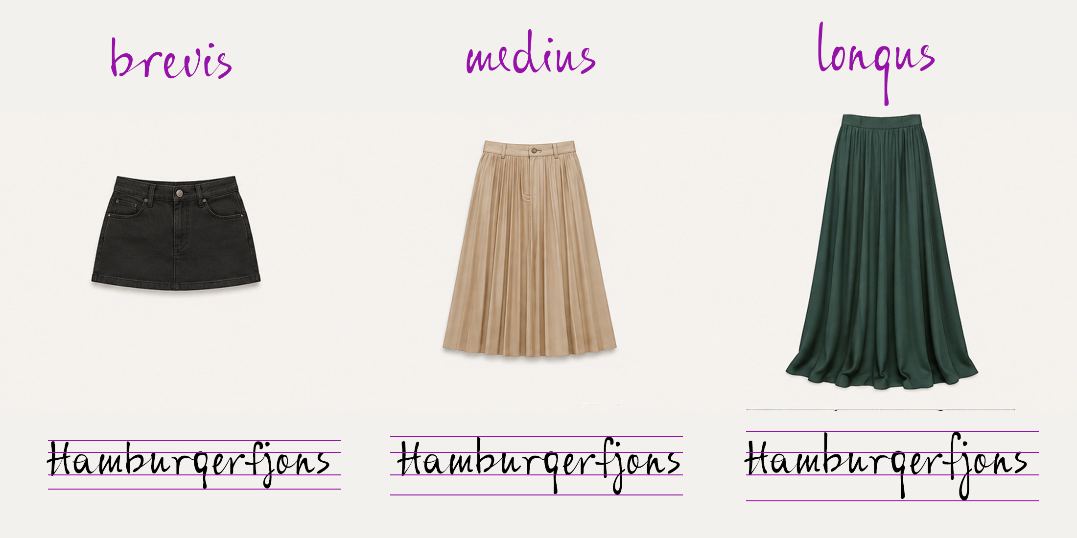
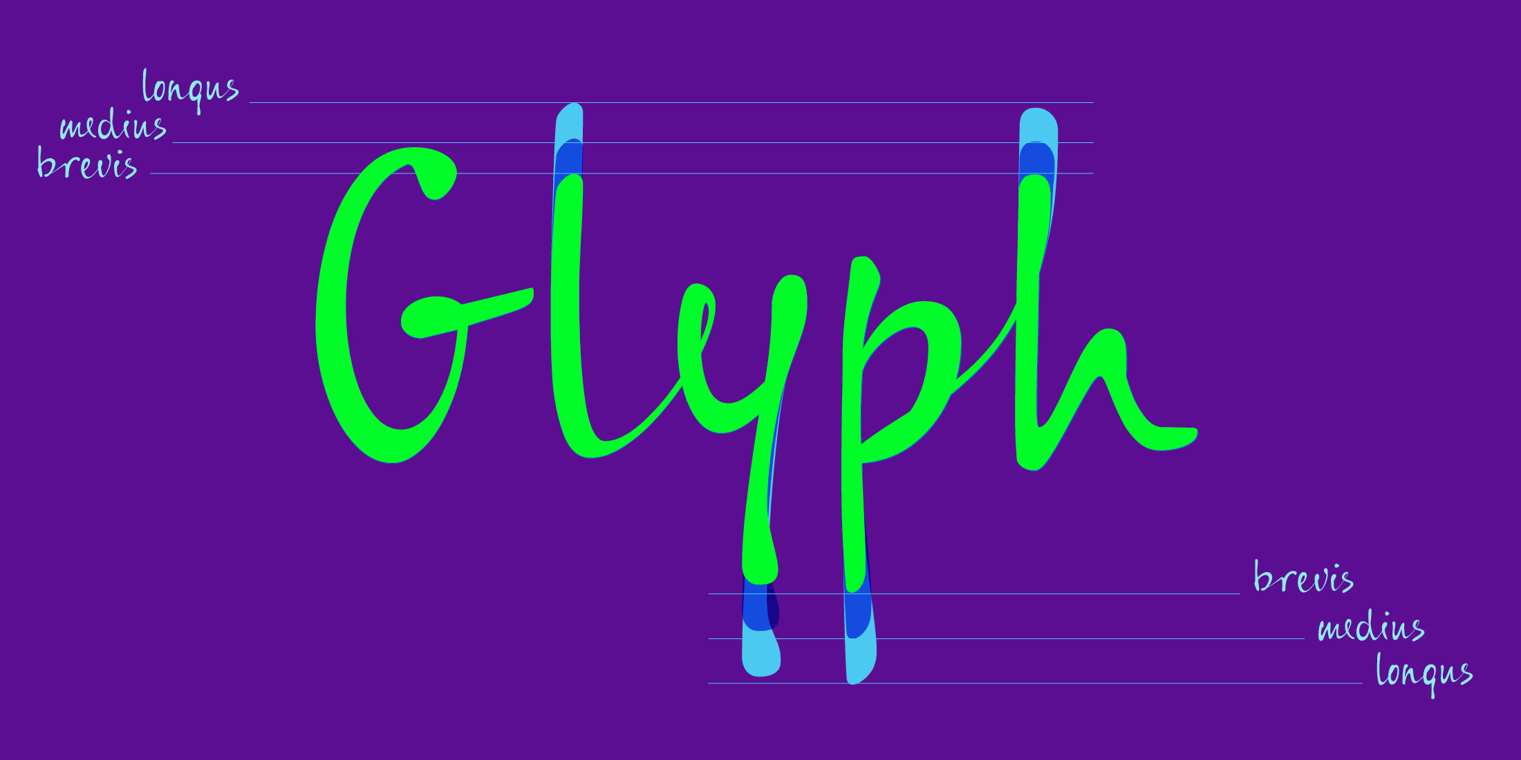
Brevis keeps ascenders and descenders short — built for dense settings and small text. Medius is the balanced default. Longus extends them fully, the most expressive option, built for display and headline use.
And the best thing: in variable font you can define your own height.
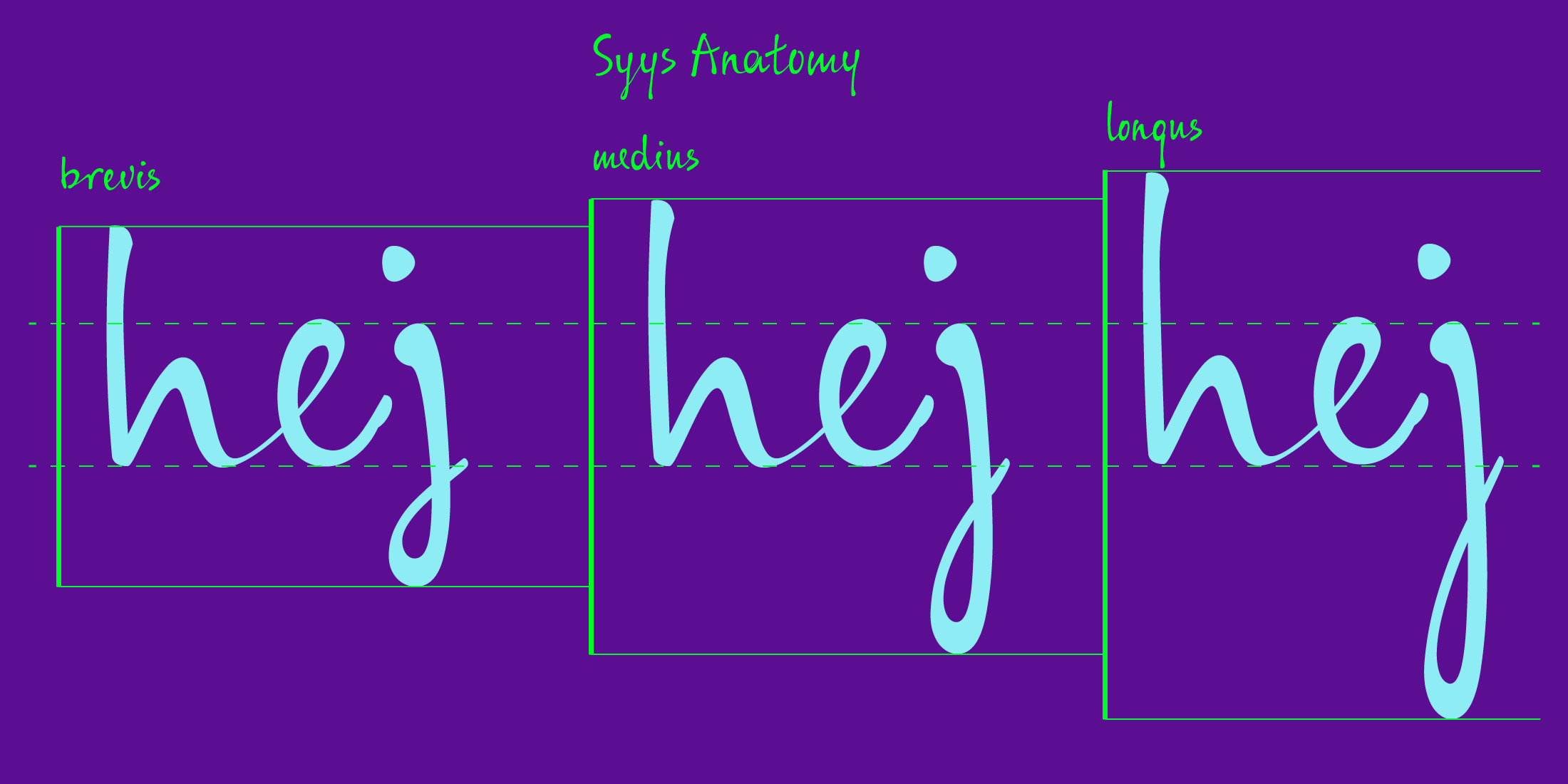
Strong contrast, fast letters, hair-thin — and somewhat elegant — connections... The casual SyysNova font doesn't try to please, and for that very reason appeals.
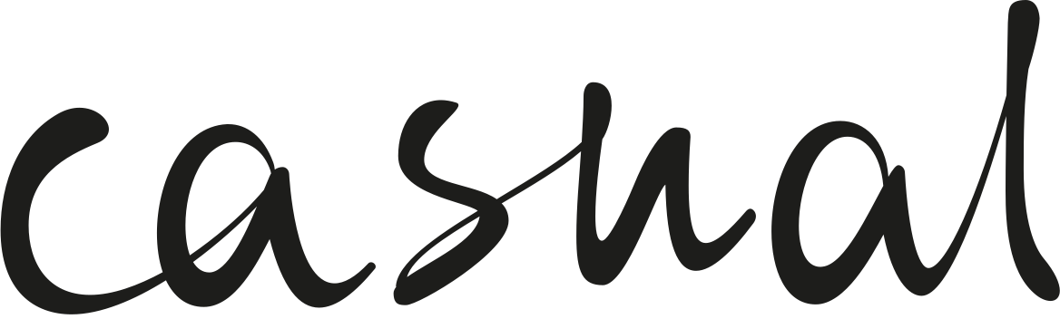
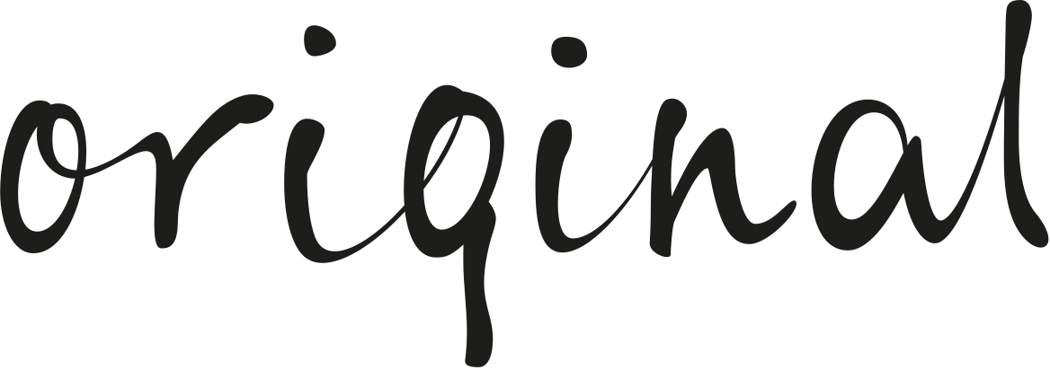
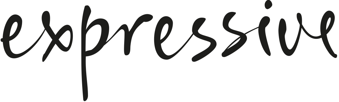
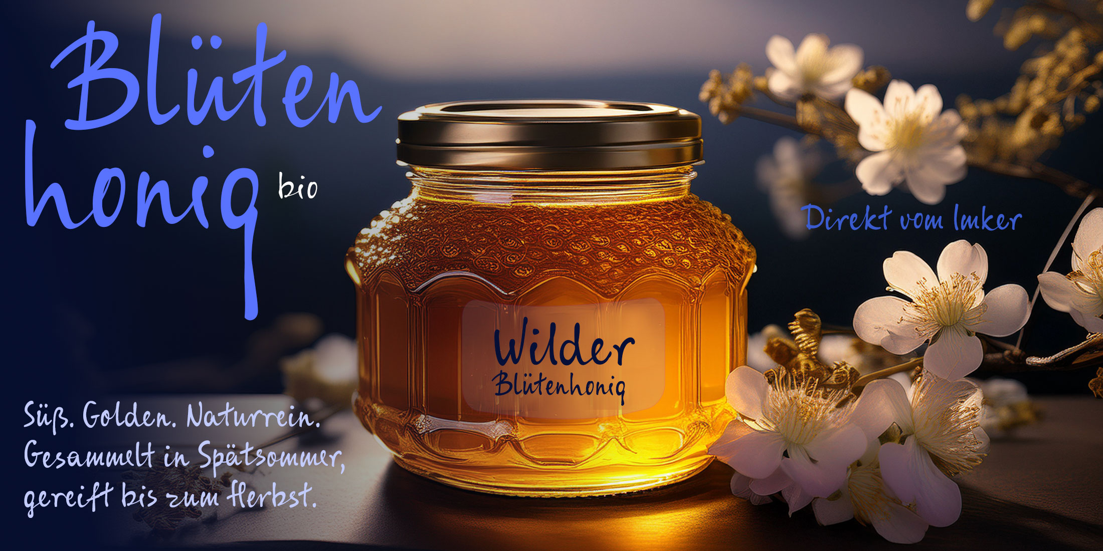
Best for:
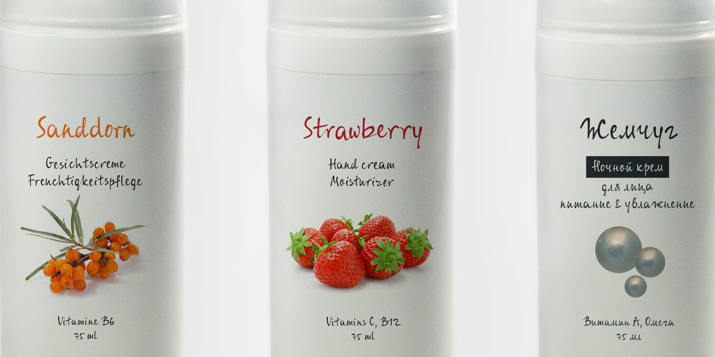
1. Dense packaging & small labels – Short ascenders and descenders keep lines tight. Built for ingredient lists, small-format labels, and anywhere line-height is scarce. >>> BREVIS
2. Body copy & everyday use — The balanced default. Readable at text sizes, expressive enough to carry headlines on packaging and editorial layouts. >>> MEDIUS
3. Display & hero moments — Full reach, full character. For logotypes, posters, and the one line on the page that needs to stop someone. >>> LONGUS
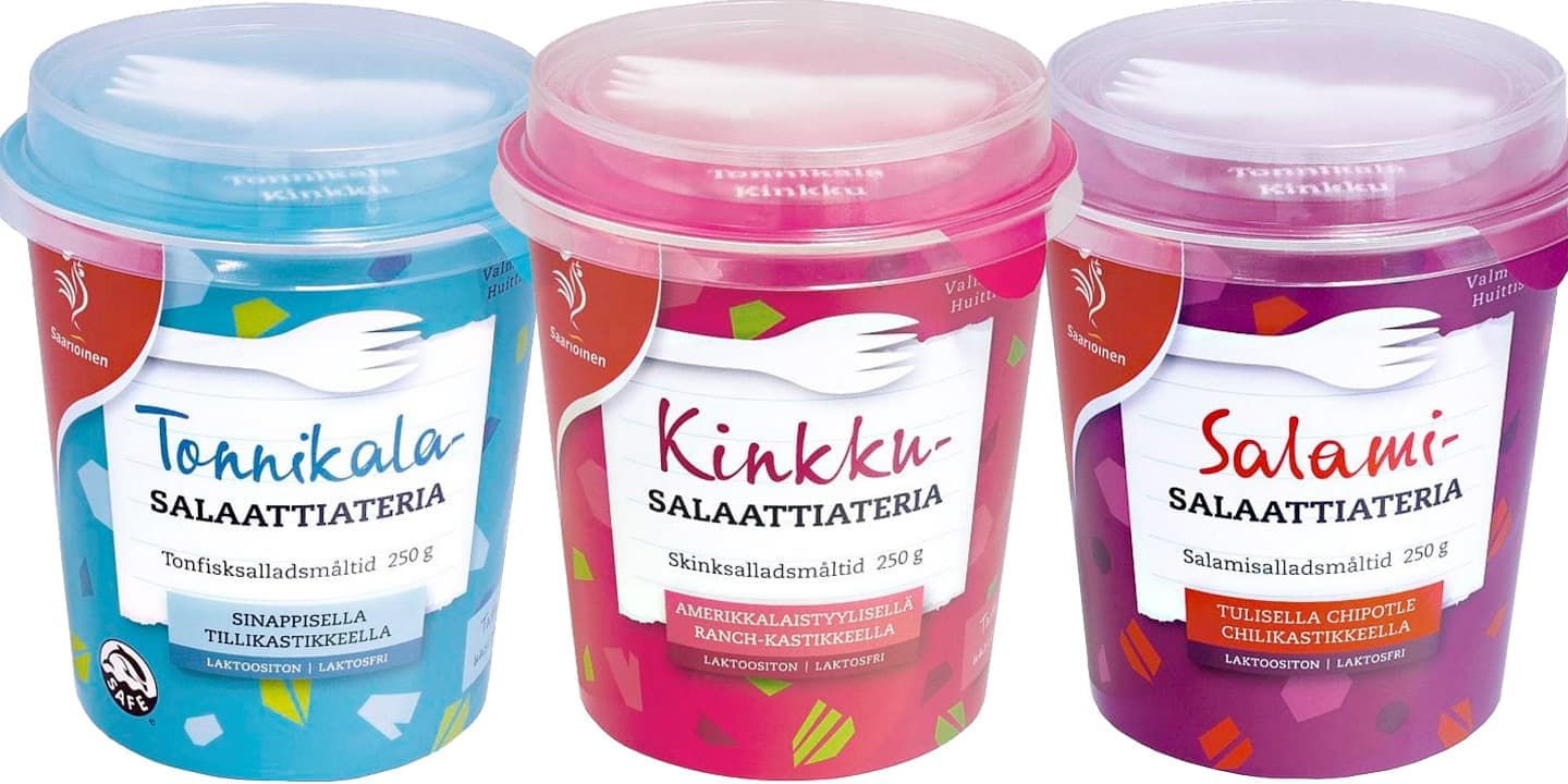
SyysNova is the next generation of SyysScript: the same energy, reimagined as a complete type system. It began as my aunt Katri's handwriting — a postcard inviting me mushrooming, in a hand too energetic to file away. The original SyysScript captured that gesture in one length. SyysNova rebuilds it as a system: three weights, three lengths, one variable font, all carrying the same hand.
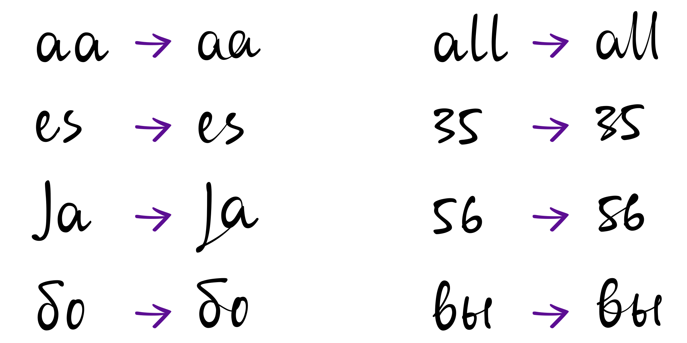
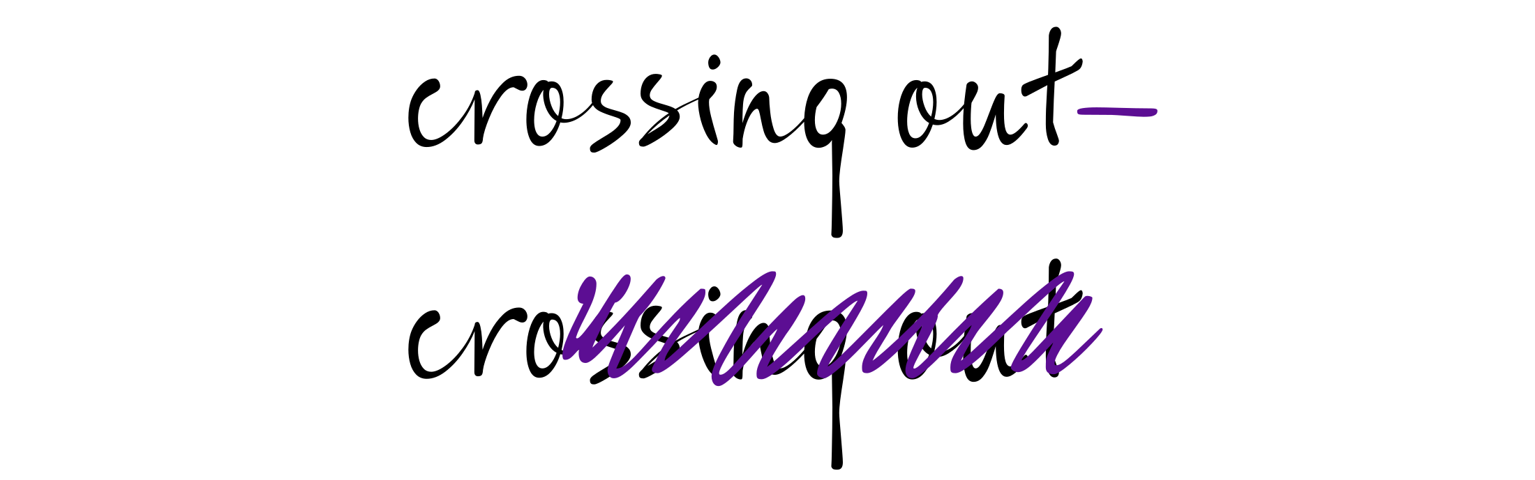
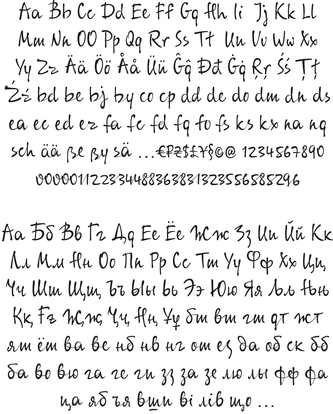
SyysNova has numerious alternates and ligatures that keep handwriting natural across all styles. It supports Latin and Cyrillic Extended Scripts.