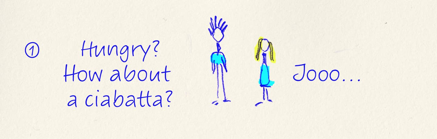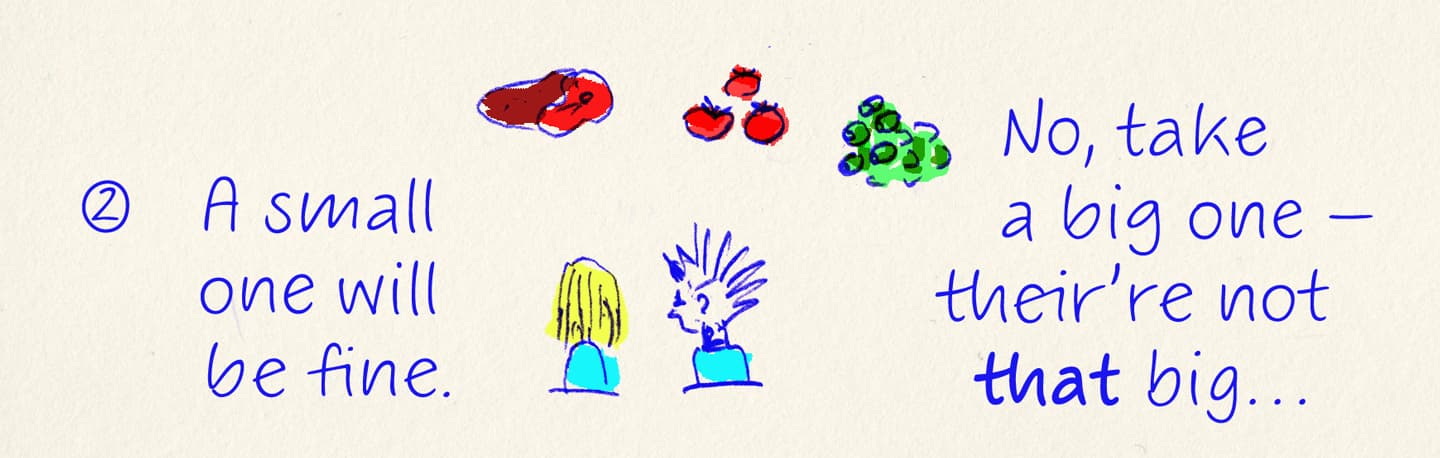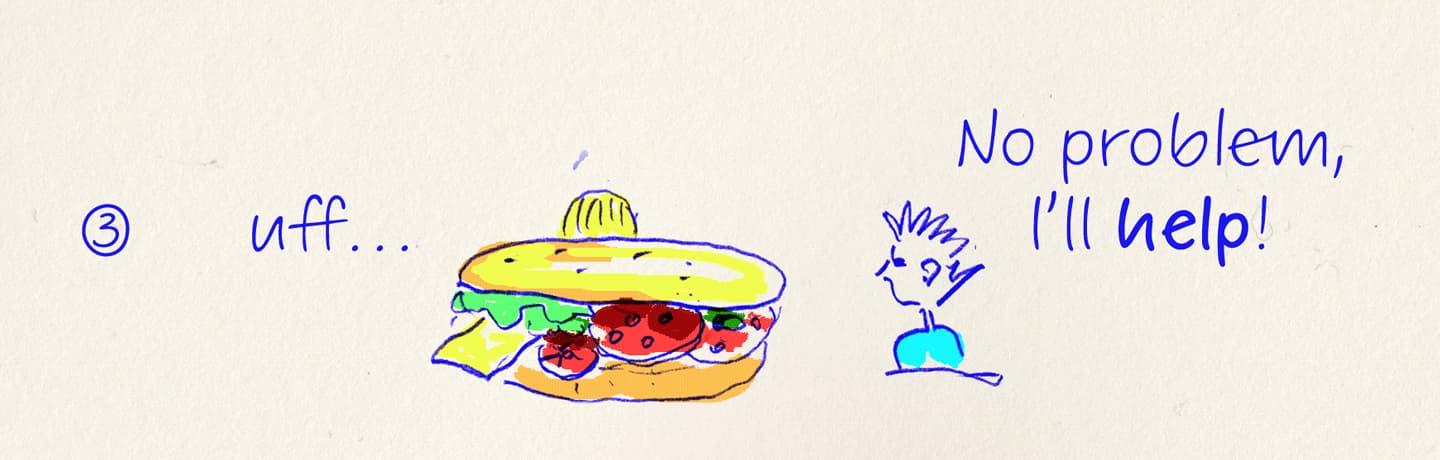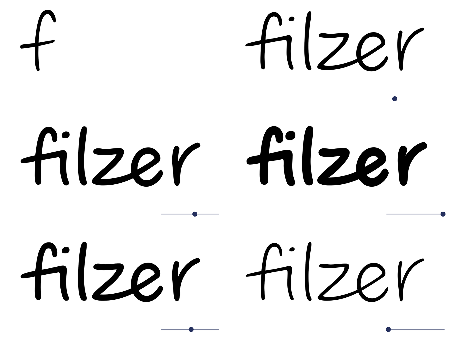
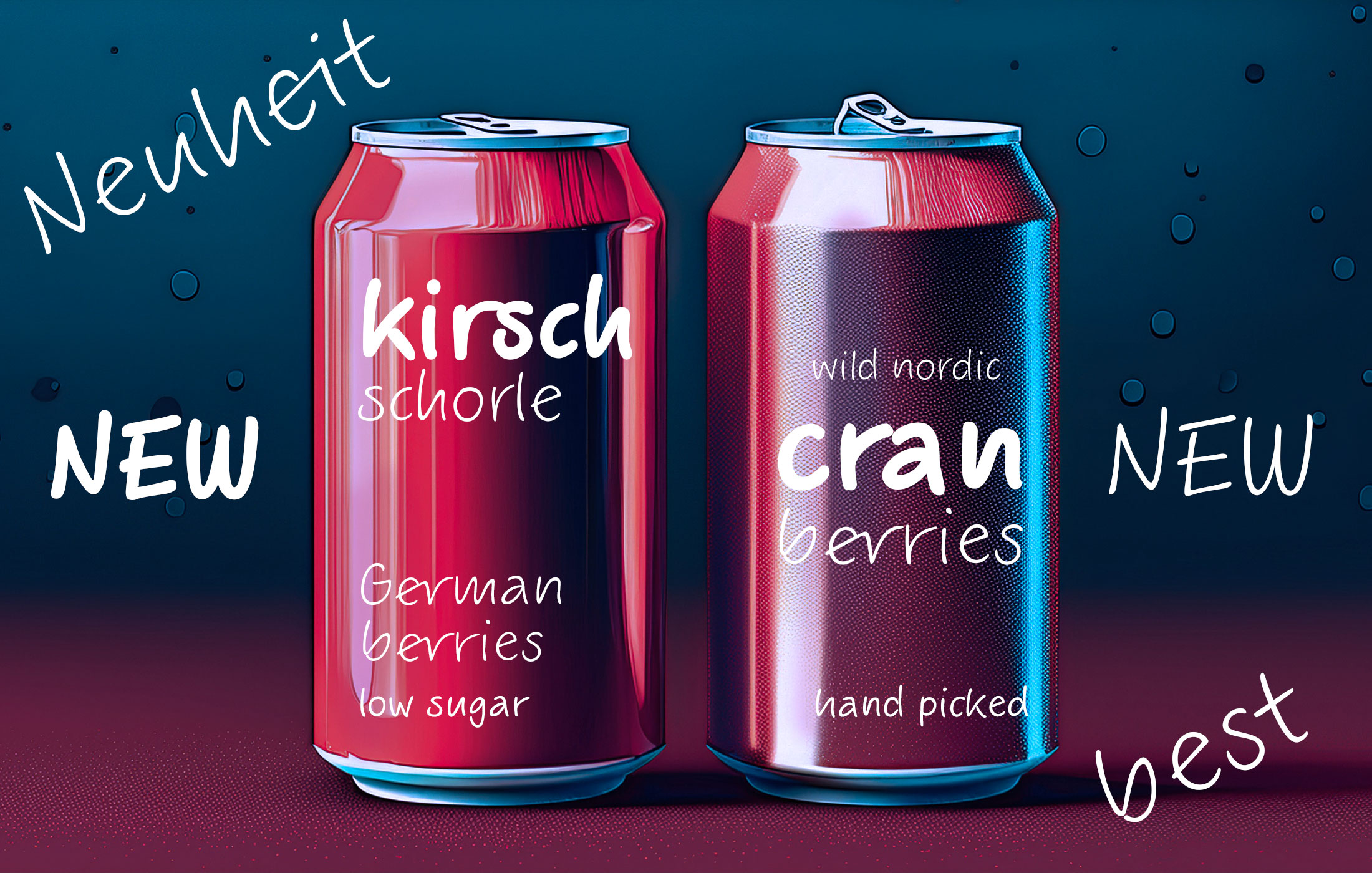
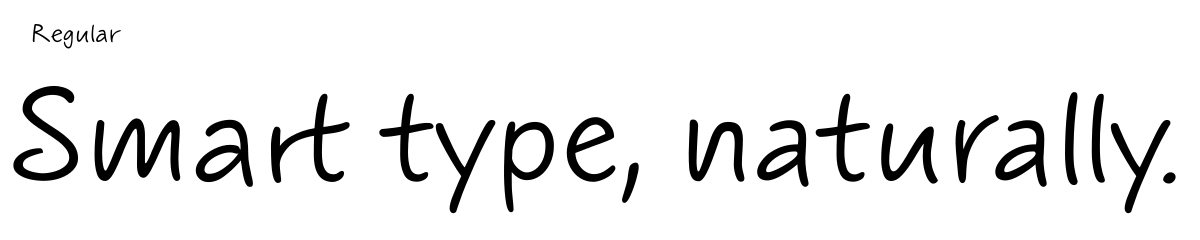
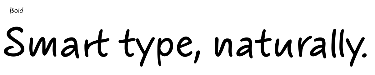
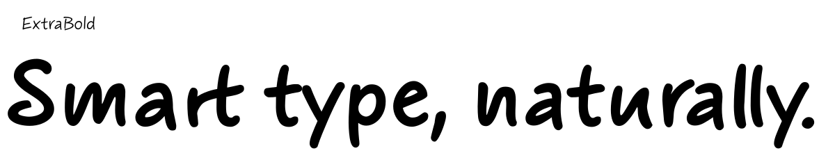
Filzer is the German word for felt-tip pen. That's exactly what this typeface feels like: the slightly soft, confident line of a marker moving across paper — not precious, not hurried, just clear. Put it anywhere and it works. On retail products. In a restaurant menu. In a comic strip. Not because it adapts — because it belongs.
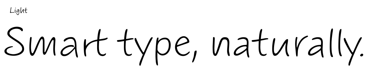
The secret to that naturalness is rotation coding: every letter and every number has four subtly different alternates that cycle automatically through a text. Nothing repeats in the same way twice, so a block of Filzer never looks stamped. Filzer comes in four weights — Regular, Medium, Bold, and Extrabold — with Extended Latin and Extended Cyrillic.
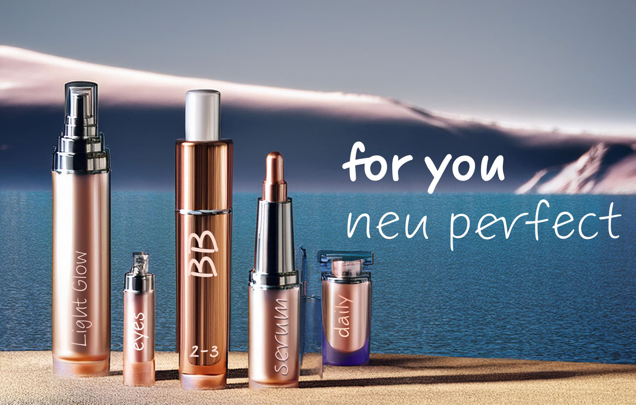
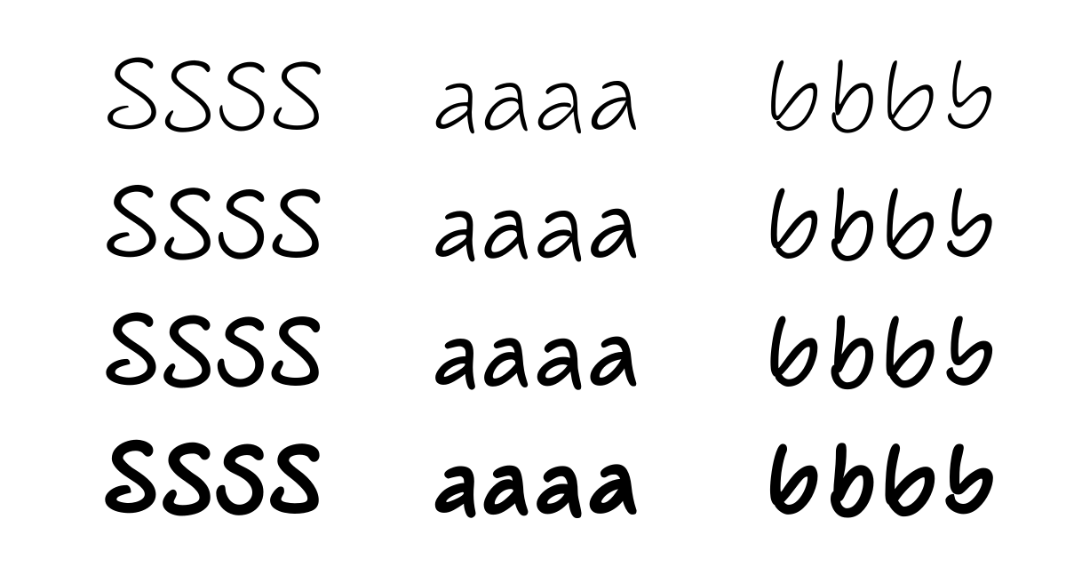

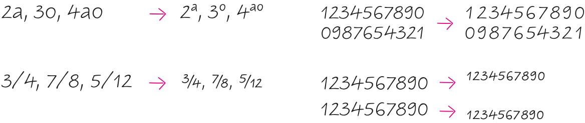
Filzer uses a special trick to create a natural feel: Rotation coding for four alternates of each letter and each number lets glyphs appear in a lively sequence and reduces repetitions to a minimum. Some other Flizer'ss OpenType features are: tabular figures, contextual alternates, stylistic alternates / stylistic set, capital spacing, case sensitive forms, superscript, scientific inferiors, numerators, denominators, fractions, ordinals, historical forms, localized forms and ornaments.