When Julia Sysmäläinen began her Berlin career at the United Designers Network (now Edenspiekermann_) the corporate design of the Robert Bosch GmbH was a key project. It went on for many years and included almost everything from print, web, packaging to event design. At the time, the company also received a corporate typeface family, the Bosch Sans, designed by Erik Spiekermann on the basis of the company’s traditionally used Akzidenz Grotesk. Julia Sysmäläinen was involved in this as a consultant for the Cyrillic character set.

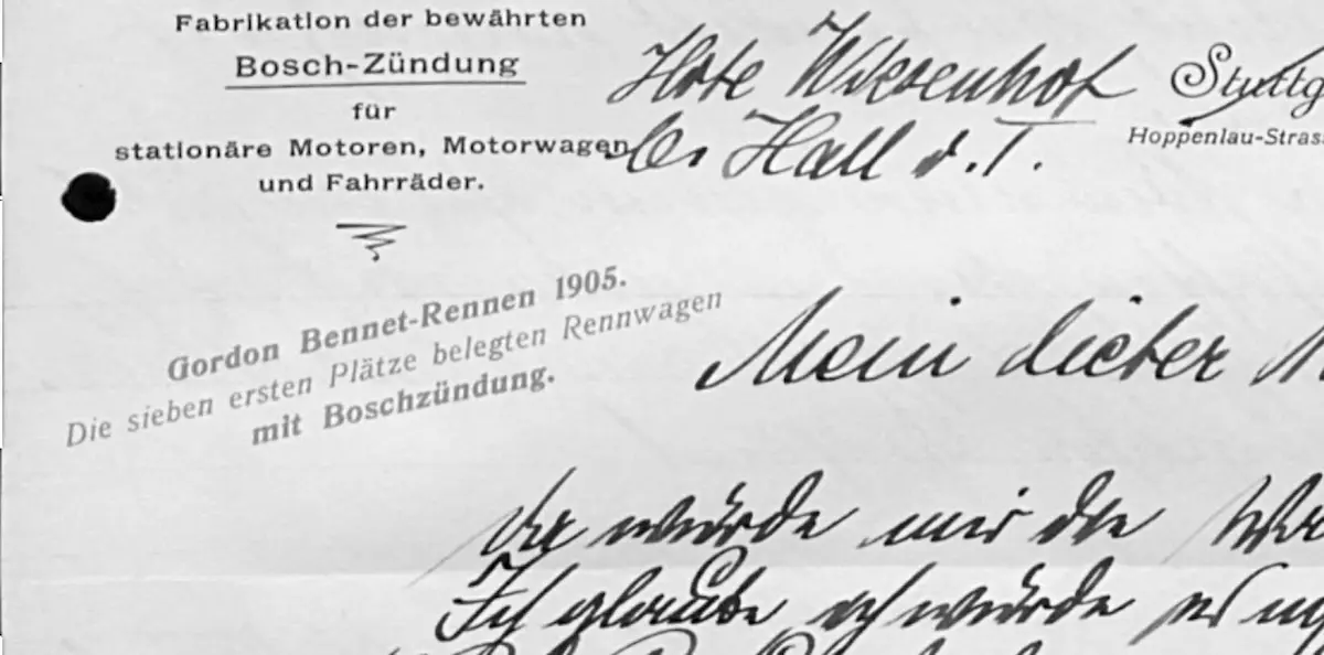
In 2018 Bosch commissioned another custom typeface, this time a script font which was to simulate the handwriting of company founder Robert Bosch. Julia’s previous experience with transforming historical personalities’ handwritten texts into digital fonts made her predestinated for this job.

The task was tricky, not because Robert Bosch’s handwriting is too technical looking or boring. In fact it is quite a masterly flowing script. But Robert Bosch usually wrote in German Kurrent, a writing style popular only till the 1930ies, and hardly any German – let alone other nationals – can read it today. So to begin the project, research had to be done at the Bosch Archive: Did any written material exist where Bosch wrote in Latin script? Were the Kurrent letterforms sometimes clear enough so they could be used as sources for Latin characters? Examples of both could be found, and in the end there was sufficient material to start the actual design work.
Given the alternative “very Bosch but hard to read” or “easy to read but less Bosch” the colleagues from the Robert Bosch GmbH chose the almost impossible: “very Bosch and easy to read”. A second specification was that Bosch Script was to correspond well with Spiekermann’s Bosch Sans in its proportions while strongly contrasting in form, so they would make a good pair for headlines, intro-texts and quotes.

The resulting OpenType font is – like Robert Bosch’s handwriting – an almost fully connected script typeface. It reflects the original texts in its tight spacing and strict adherence to the baseline. Some of the letterforms are still in Kurrent-style, but slightly reshaped to make them more familiar to contemporary readers. All letters have slightly modified alternate glyphs which are automatically inserted depending on their position in the word. In addition to single-glyph alternates there are multi-glyph ligatures which capture special features in Bosch’s handwriting style.