Retail Fonts

Emily In White – the Emily Dickinson Font

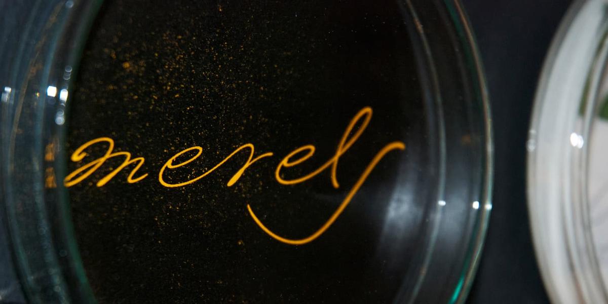
Exhibition object with typeface “Emily In White”

She did not live to experience her breakthrough as a poet, but today she is considered one of the pioneers of literary modernity – the American lyricist Emily Dickinson. During her lifetime (1830-1886), she did not share her art with the public. Emily Dickinson lived in seclusion in Amherst, Massachusetts. Her neighbours called her “the white” because she occasionally walked through the garden at night in a snow-white dress, otherwise she rarely left her room. After her death, over 1700 poems, notes, poetry albums, letters – and her last will – to burn them – were found in a heavy wooden chest. Her younger sister Lavinia decided otherwise, and so Emily Dickinson’s poetry was preserved for posterity.
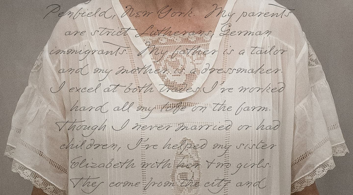
Art object by Rowena Dunlap Burke and Eric Hovermale”
“Emma, Plain Emma” is an art object with Emily In White font by Rowena Dunlap Burke and Eric Hovermale at the Newport Art Museum, Rhode Island.
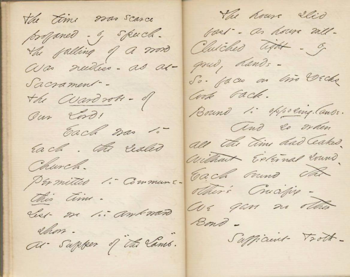
Emily Dickinson´s handwriting
Emily Dickinson wrote her poems in pencil or pointed pen, sometimes slanted, sometimes joined. (Source: Project Gutenberg’s Poems: Three Series, Complete, by Emily Dickinson; Release Date: May 3, 2004 [EBook #12242], Produced by Jim Tinsley)

Form follows lyrics

Dickinson’s poem number 1263 begins with the line: “Tell all the truth but tell it slant”. For font lovers, this reads like an invitation to take a closer look at Emily Dickinson's handwriting since “slanted” is an internationally used term in typography. In fact, word content and visual style seem to compose such a beautiful unity in the poet's work that we just couldn’t resist developing a typeface transmitting this spirit.

Opentype features of Emily In White font: alternates.
Versatile font: Context-dependent alternative characters - automatically or manually controlled - give Emily In White a natural handwriting appearance.
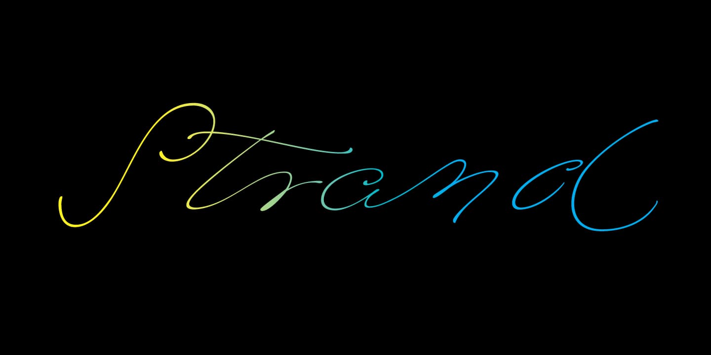
Word in Emily In White: elegant
Writing with Emily in White font

Authentic connected handwriting

The script font bears the light-hearted name “Emily In White”, which recalls both Emily Dickinson's fondness for white dresses and the lightness of her notes. Publisher Thomas Higginson said of his first encounter with Dickinson's writings: “I received a letter from Amherst in a handwriting so peculiar that it reminded me of the famous fossil bird tracks in the university museum”.

Emily Dickinson´s handwriting
Emily Dickinson’s delicate handwriting has been described as “breezing” and “reminding of bird tracks”.

We attached great importance to making the font as natural looking as possible. This is ensured by a huge pool of alternative letters which are controlled by OpenType functions. For the user, this means automatic letter flow with very little manual intervention.

Emily Dickinson´s OpenType in action
OpenType feature code in action

Styles of Emily In White Type Family: Three line weights, more lightness

Three weights of Emily In White script font
The three grades of Emily In White help to adapt the lightness of the font and thus its legibility to the features of the background it is set on.

Emily In White’s three weights, simply numbered from I to III, allow for sensitive subtle fine-tuning. If you want to add the finishing touches to this poetic typography, there is no getting around the Swash styles, which make it easy to create decorative lines, borders and patterns (see also Emily In white Swashes .
Opentype features of Emily In White font: Swashes
Emily In White and Emily In White Swashes fonts combined

OpenType functions (a selection)

Opentype features of Emily In White: contextual alternates and ligatures.
Contextual alternates and ligatures of our script font
Opentype features of Emily In White: alternate figures and fractions.
Alternate figures and fractions
Opentype features of Emily In White: superscript and subscript.
Superscript and subscript

The font in action

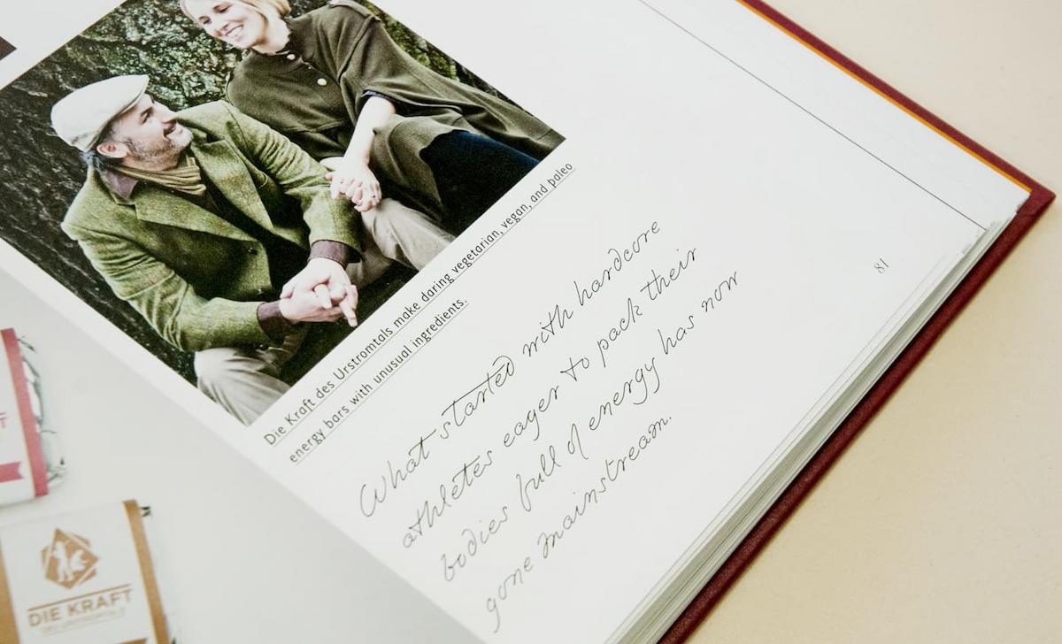
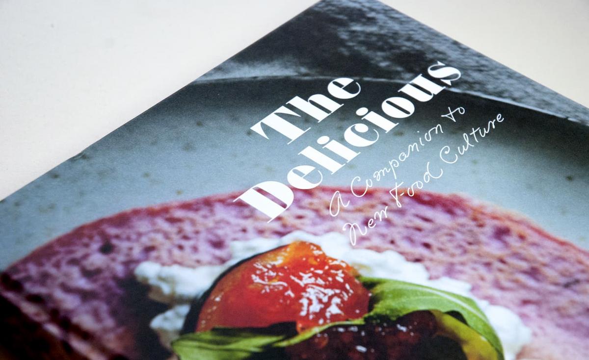
Cover with Emily In White typeface in “The Delicious” book, Gestalten publisher
Emily In White font in the book “The Delicious”, companion for a new food culture, published by gestalten publishing house
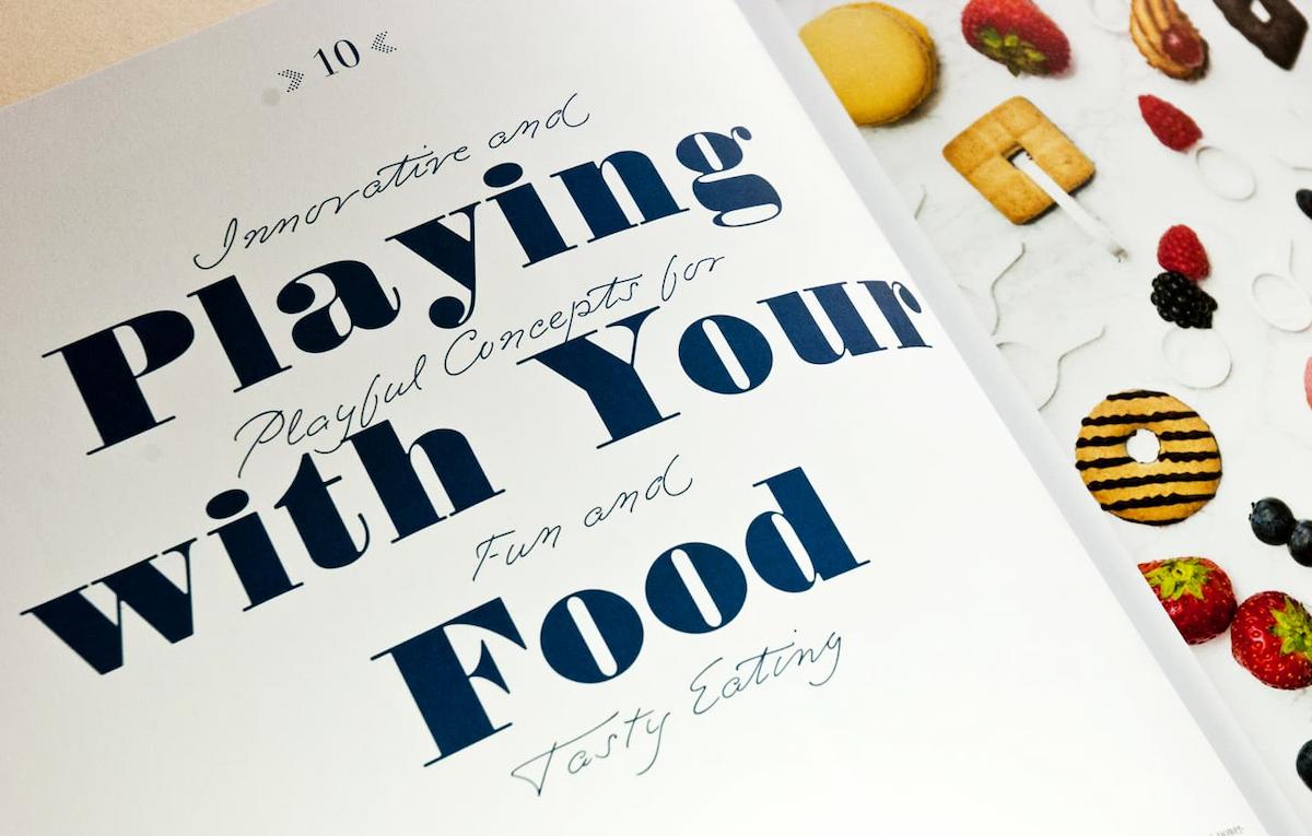
Spread with Emily In White typeface in “The Delicious” book, Gestalten publisher
Emily In White typeface in “The Delicious”
Emily In White typeface, used in “The Delicious” book, Gestalten publisher
Emily In White typeface “The Delicious”
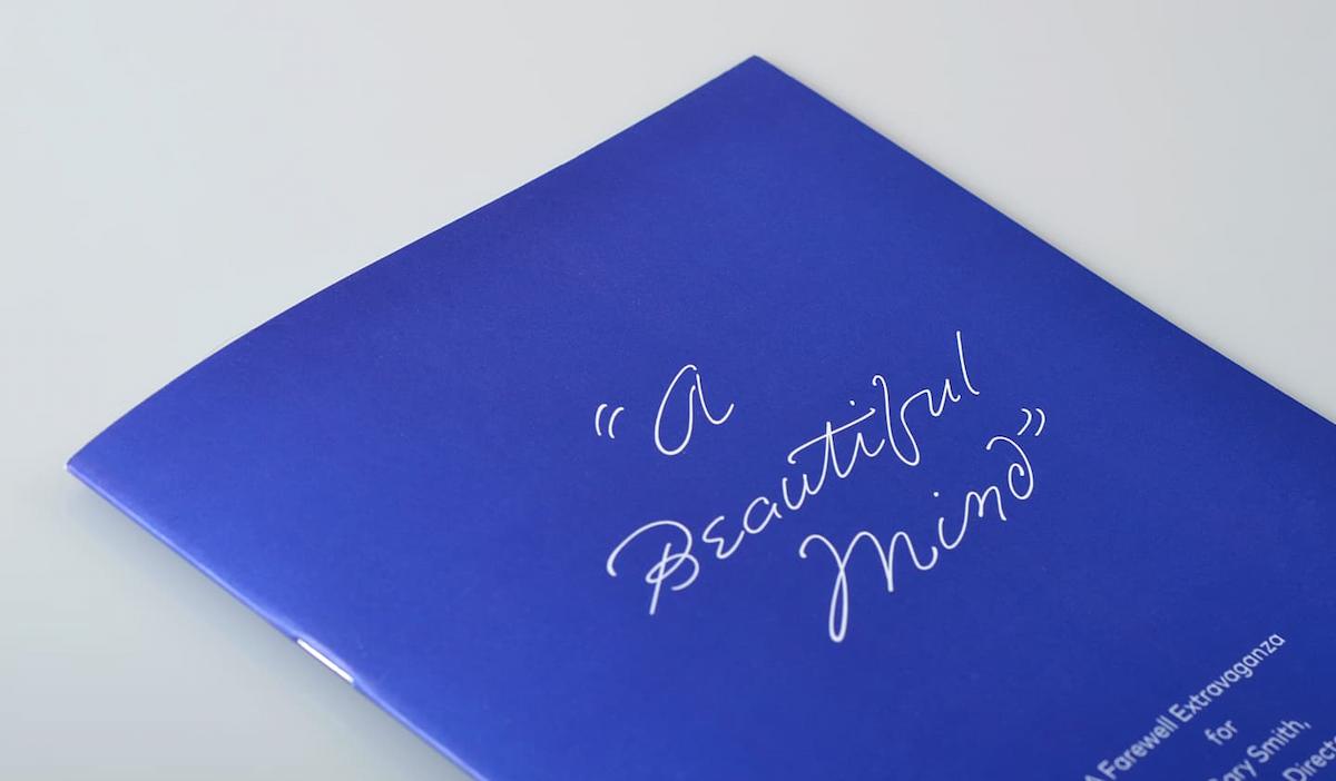
Emily In White typeface on “A Beautiful Mind” invitation
Event invitation “A Beautiful Mind” ", set in Emily In White and FF Mark; for for more see Fonts In Use
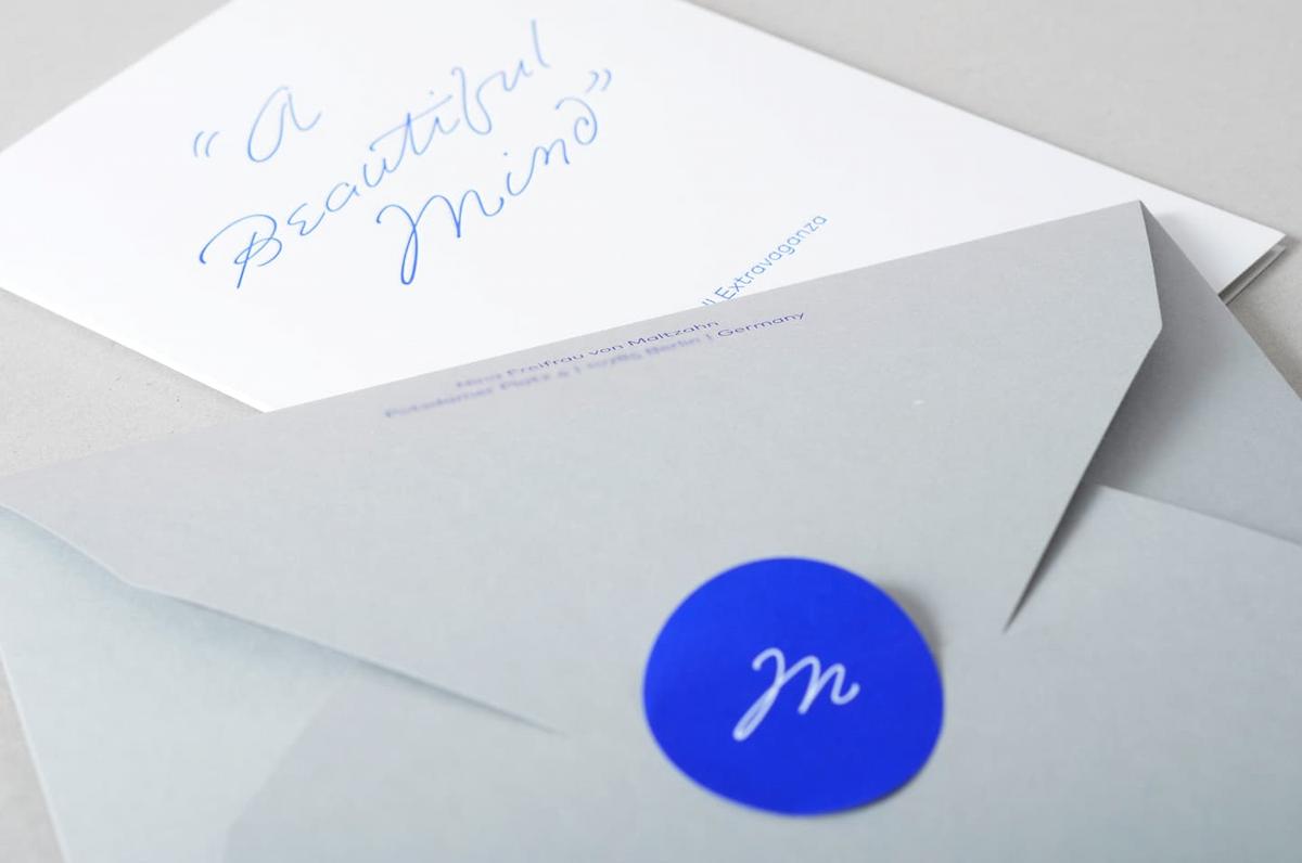
Emily In White typeface in “A Beautiful Mind” mailing
“A Beautiful Mind”: Mailing using Emily In White Typeface
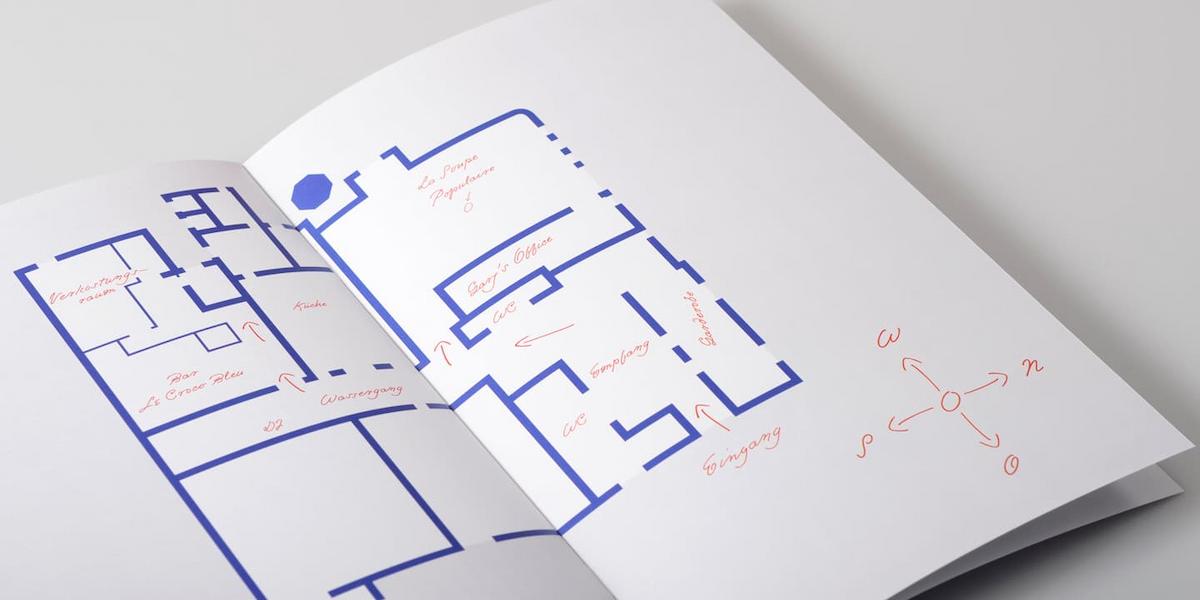
Emily In White typeface on “A Beautiful Mind” program
“A Beautiful Mind”: ground plan
Close-up of “Letters to be burned” exhibition object, texts by Emily Dickinson presented in Emily In White typeface
Installation “Letters to be burned” at The Finnish Insitute, Berlin. Close-up of an exhibition object, texts by Emily Dickinson, set in Emily In White font
Name “Emily” in 3d, in Emily In White font
Three dimensional Emily In White font in “Letters to be burned”, The Finnish Institute, Berlin
Emily In White showing
Share on Facebook