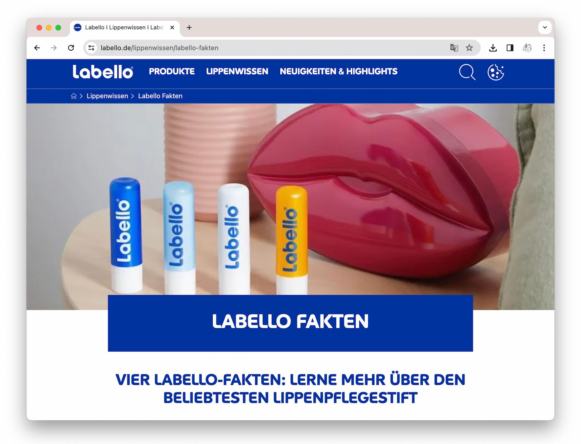
Launched in 1909, Labello lip balm, a classic of the German Beiersdorf AG, came onto the market two years before the famous Nivea cream. Its innovative tin sliding box was a sensation and became the standard for lipsticks in the years to come. Starting 1973, the twist-off stick received the Nivea blue colouring by which it is recognised all over the globe today.

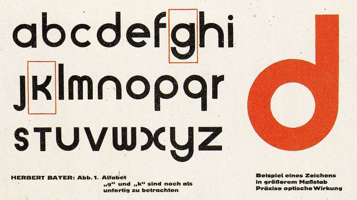
As part of the long-standing collaboration with Beiersdorf AG, Juliasys was commissioned to develop a typeface based on the Labello logo. The logotype, designed in 1973, was inspired by the geometric typefaces of the 1920ies, in particular the universal typeface by Bauhaus artist Herbert Bayer. The task was to derive a visually strong and harmonious character set from the six letters of the word mark.


As in similar projects with a historical background, some fundamental questions had to be answered: How much do the original characters have to be changed in order to achieve a harmonious and legible alphabet? Do we include upper and lower case letters? Which languages should be supported? In what surroundings will the font be used later?
The letters of geometrically structured fonts tend have a high degree of self-similarity – see the classics Futura, Avant Garde and Kabel: How do we attain uniqueness of the letterforms in spite of this, and high legibility?
The Labello project was carried out in close cooperation with the Beiersdorf Brand Management Team, and the result of the work is a typeface remaining true to its origins. At the same time it fits seamlessly into the visual style of the brand and has very good readability – both on screen and in print. Recently expanded, the Labello font covers all Western and Central European languages.